How to Enhance Your Designs with Color Shades
How can you enhance your designs with tint and color shades? Artists use quite a few techniques and colors to finish their artwork. They also use a variety of tints and color shades in certain types of designs. Just as designers need to know which images or shapes are crucial to graphic designs, it’s also necessary for designers to see the importance of the tint and color shades they choose to use in their design to optimize the viewer’s experience.
What are Tint and Color Shades?
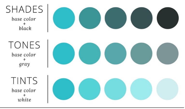
A tint is a color created when white is added to any hue on the color wheel. The color is lightened and unsaturated as a result. This is how you get light colors. The next question would be how to make color shades? Well, shades are created by adding black to any hue on the color wheel. You can also create tones by adding grey to a base color, as shown below.
Generally, almost any design will look much better if some tint and color shades are incorporated. The correct tint and color shades of contrast are vital if the designer is looking to capture the attention of any viewer. The shading or color tint used for your design is crucial, as it can trigger different emotional responses from people. The beauty of shading is that it doesn’t require a great deal of time or technique to be effective. Shading brings life to a design and gives it a 3D feel and in-depth look, which helps it stand out more and makes a design look more surreal. In comparison, traditional plain colored techniques can lack innovation and creativity and can be difficult for the viewer to interpret or see any value in the design.
In addition to encouraging pleasant feelings, a harmonious blend of colors can also spur a viewer into the action. This is where creating a color palette and color code comes into play. Limiting your color palette to 3 colors is vital, so the viewers are not confused by the number of colors used. Colors that complement each other can also be used in your color palette.
Color codes used in a design will catch the eyes of the targeted audience, and the tint and shades will make your design pop.
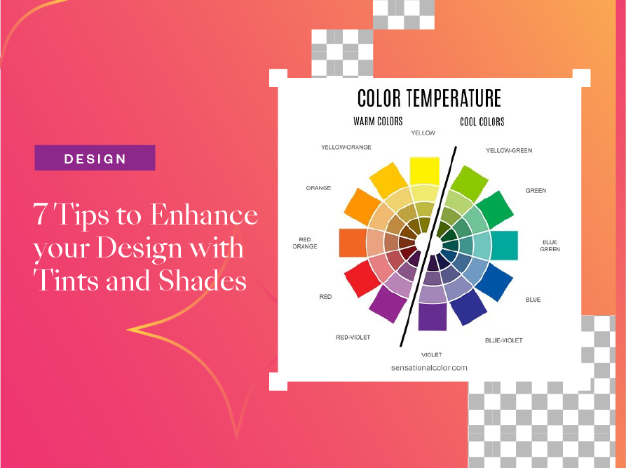
7 Tips On How You Can Enhance Your Design With Tint And Color Shades
Here are 10 tips on how to choose and apply the right tones and color shades to your design!
1. Before you design, conduct research. Before beginning your artwork, make sure you have all the details you need. Read, study, and research to know what you want to create and communicate to your audience.
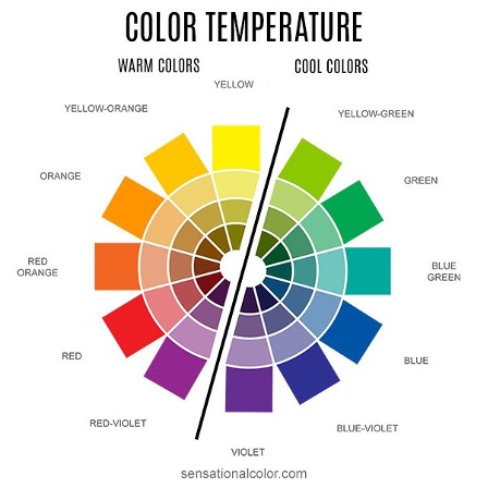
2. Consider your target audience. Designers must consider their target audience because designs or any creative work is created to convey a message to the audience. In this regard, you have to decide on which is the best tint and color shades to use. If it is for a more mature audience, you will go with a shade, while if it is for a youthful group, you will choose a tint. The color palette below can help with this.
3. Decide what colors to use. This is where you can research tint and colour shades ideas to add to your artwork. In graphic design, color schemes can be used to draw attention, organize content, evoke emotions, and make a design look more appealing.
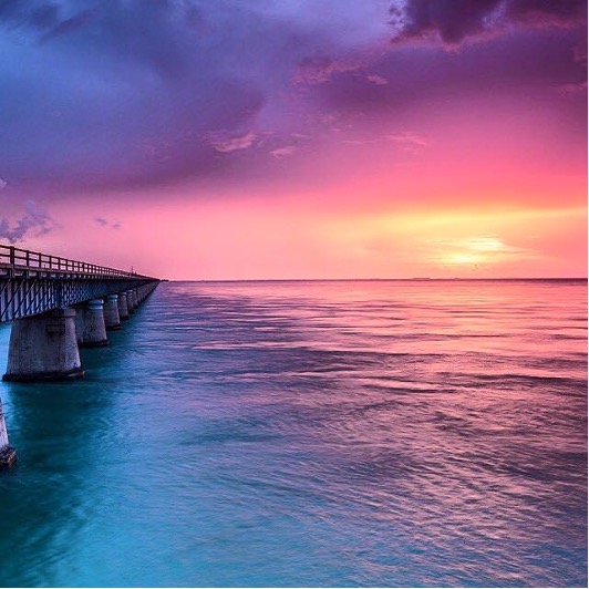
This artwork is comprised of a variety of tints and colour shades, and they blend together to create a beautiful picture.
4. Make use of color palettes. Your design will look more personal and appealing if you use a color palette.
5. Let white space do the talking. White space can be used to increase legibility and draw the reader’s attention without looking cluttered by surrounding words, phrases, or images with it.
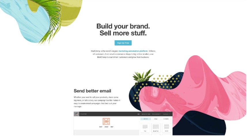
This picture of a website clearly shows the use of white spaces. The colors that are on it can clearly be seen because of the white spaces surrounding it.
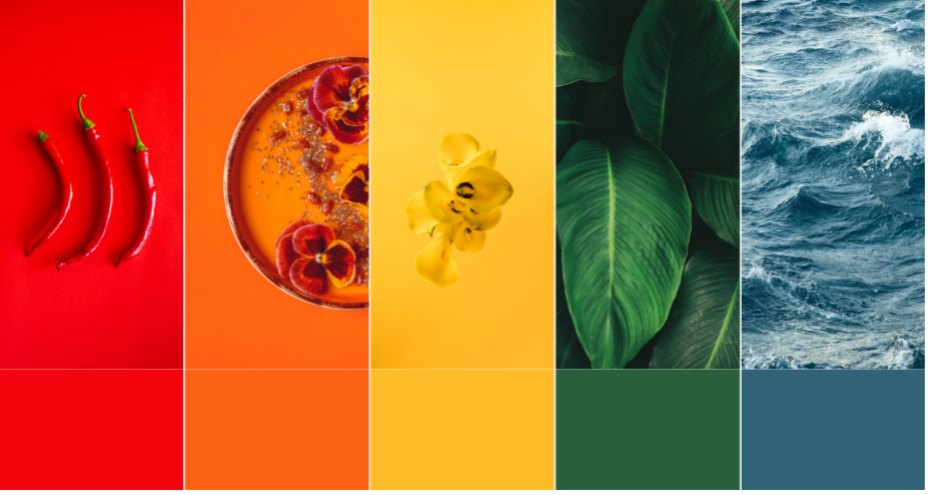
6. Contrast warm and cool colors. This is to create a mood and legibility; the contrast is a critical element of the design.
7. Simplicity is key. Tint and shades should be purposeful and not overdone.
Edit Photos & Create Collage For Free With Collart
As we see, tint and colour shades are essential in creating a unique design, and we can do this on a digital level. You can use an app like Collart free photo/ collage editor to create your tint and color shades. We can’t wait for you to try your hand at creating beautiful photo edits and collages for free on your iOS devices with the Collart app!

⚡ Find more tips here!
👉🏻 Follow Collart: Facebook | Instagram | Twitter | Pinterest | YouTube | Website
Related Posts


