32 Color Combinations and How to Use Them in Your Designs
- November 24, 2021
- Inspiration
Want to learn more about color combinations and how they can help you enhance your designs? All around the world, designers, developers, and content creators use color in their pieces. Whether it’s multiple colors, a color palette, or just some neutral colors, they depend on what they do.
Designs and color combinations go hand in hand as color is the attention grabber for the design. When people see a product, the colors and structure appeal to their senses and make them want to buy them. It adds the mood, and a perfect combination adds that creative touch. These eye-catching color combinations appeal to the audience’s senses, so when they look at a product, they are more likely to buy it if it is colorful.
Best 32 Color Combinations to Incorporate in Your Designs
Color is one of the key elements that bring a design to life, give it meaning, and paint a picture of what you’re trying to say. Color combinations are essential as they communicate a specific message to viewers and showcase a particular niche or business strategy. Here are 50 color combinations ideas that you can use to create your ideal design.
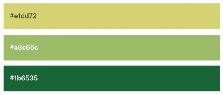
1. Deep Pine Green, Orange, and Light Peach
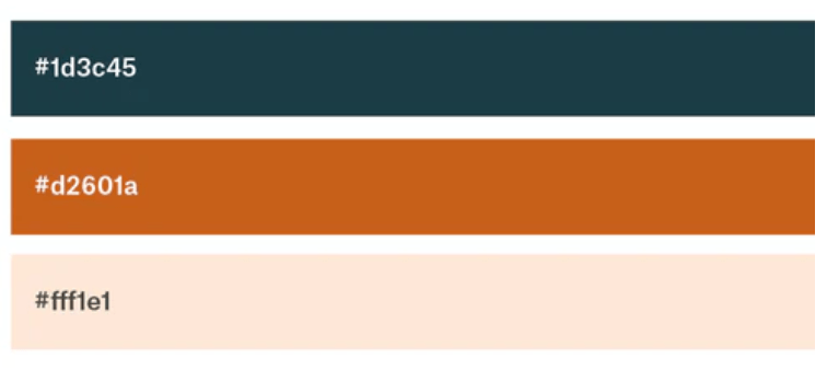
The orange color is one of the least used brand colors, but it stands out like a bright ray of sunlight. Light peach offers a youthful look, while pine green accents offer some warmth and natural comfort.
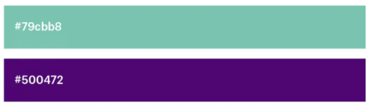
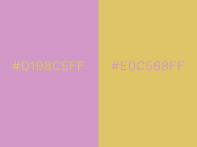
2. Pink and Raisin
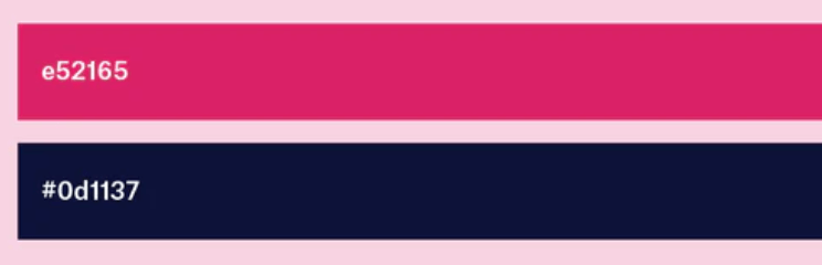
These two color combinations come together to form a color unity. It creates upbeat energy, which is expressed when this color is used on logos—the colors showcase youthfulness with a dash of femininity.
3. Red, Sea- Foam, Jade, and Violet
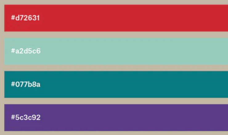
This four-color combination is quite popular in creating floral designs, and each color compliments the other, creating a total balance.
4. Shades of Pink and Brown
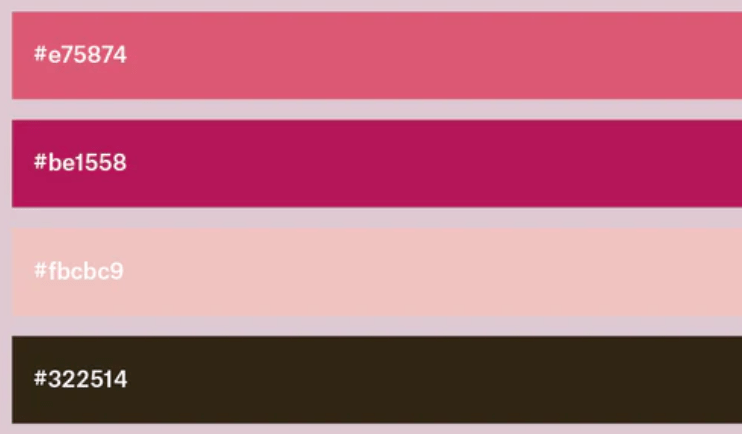
Using different shades of pink together enhances the overall design and creates depth and movement. The contrast between dark brown and pink also helps to emphasize the seriousness of the design.
5. Royal Blue and Peach
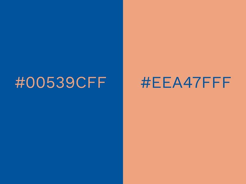
This primary-color is bold yet showcases playfulness. The royal blue push the peach into the spotlight, creating a modern finish.
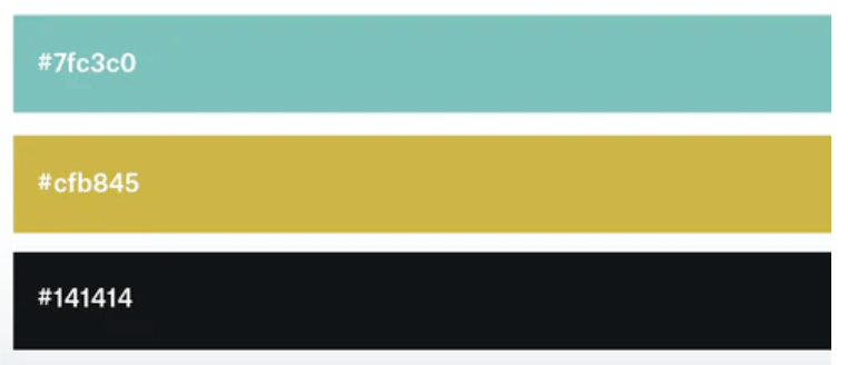
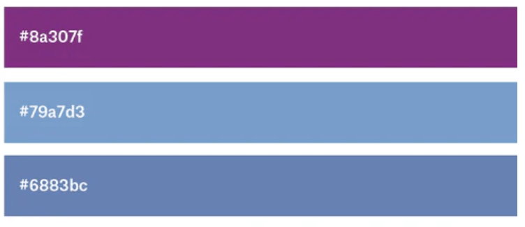
6. Mauve, Sapphire, and Powder Blue
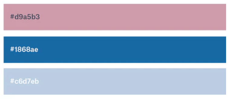
This color combination is rich, and the energetic sapphire color adds a more modern feel.
7. Blue, Maroon, and Indigo
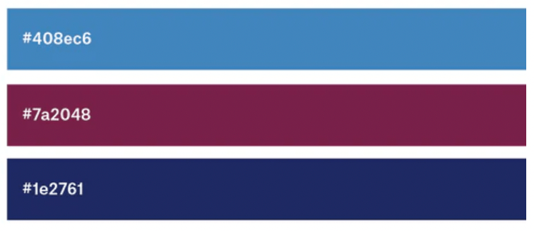
The color blue, as the scheme’s central hue, speaks of trust and responsibility. The gradient, moving over to indigo and maroon, reveals cutting-edge passion.
8. Yellow-Green, Olive, and Forest Green
Three shades of green provide the perfect backdrop for this refreshing mint and lime drink. Together, they develop an exciting, young flavor.
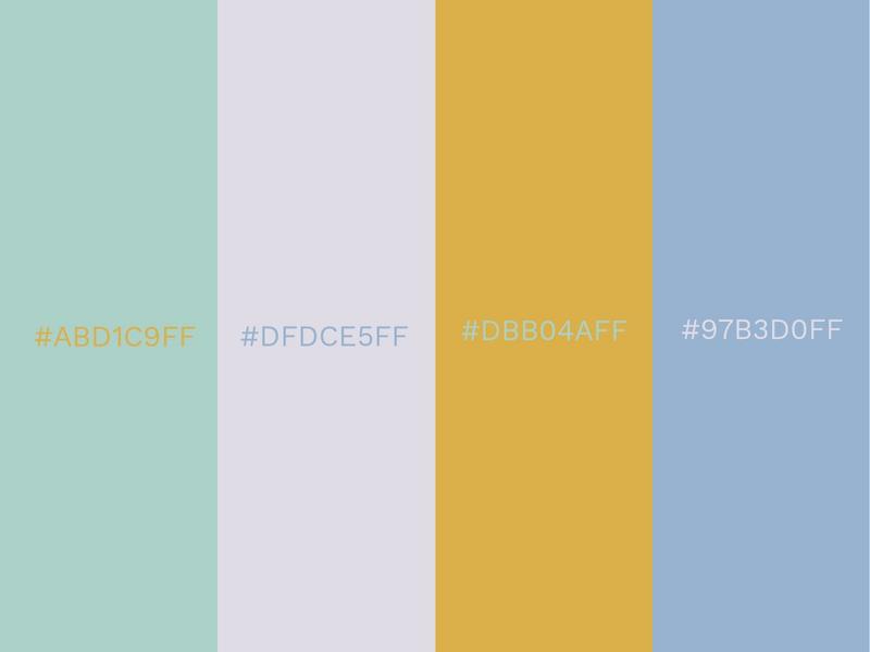
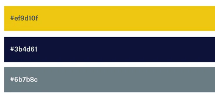
9. Navy, Cchre, Burnt Sienna, and Light Grey
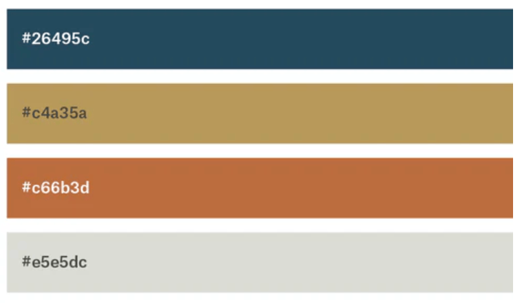
These earth-tone packaging designs benefit from a neutral background that amplifies the colors.
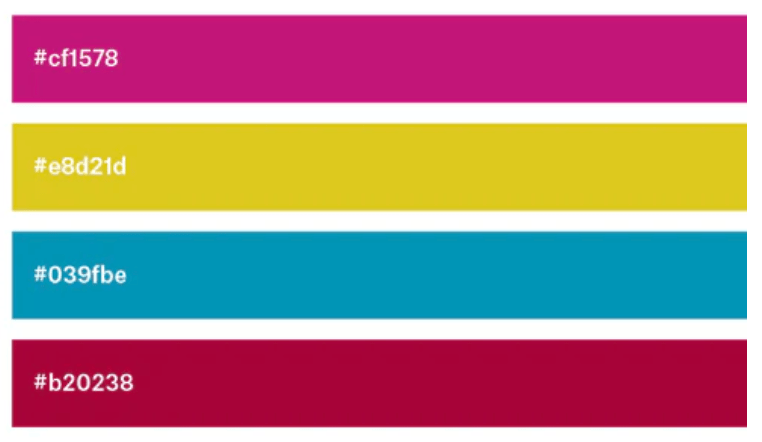
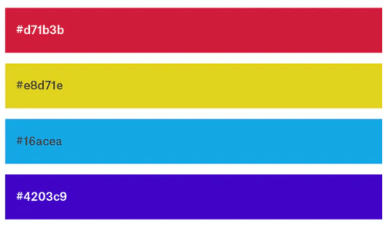
10. Magenta, Yellow, Black, and Cyan
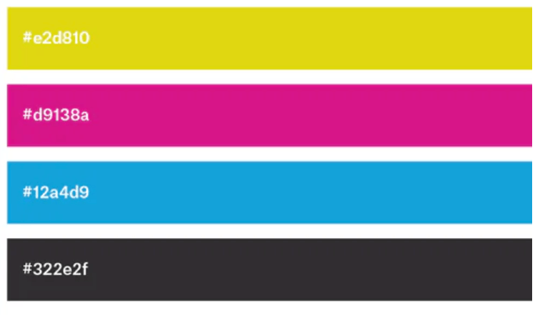
This color combination is also popular in regards to painting; artists and designs use them a lot. It creates an atmosphere of vibrance and cheerfulness.
11. Sea-foam, Salmon, and Navy
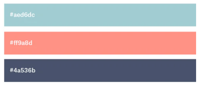
These pastel colors will evoke the feeling of being by the sea, with their soothing blues and salmon.
12. Pastels
Pastel colors convey a delicate air, so make sure your design conveys the same feeling if you’re considering using this color combination.
13. Goldenrod, Magenta, Brick, and Turquoise
Another four color combinations, each accentuates the other. The more prominent color we can see is a bright yellow, which gives off a feeling of happiness, while the other colors represent maturity.
14. Plum Purple, Viola, Seafoam Green
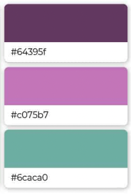
Stunning combinations of deep purples, pink-purples, and seafoam greens are sure to soothe you. Yoga studios, wellness centers, and spas can capitalize on this brand combination.
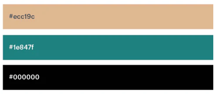
15. Mustard and Black
These colors normally represent or showcase a feeling of authority and a modern Era. The two-color combinations are usually used when creating signs and symbols. It gives a warning or danger vibe to onlookers.
16. Turquoise, Mustard, and Black
Cool and warm tones work together for a serene atmosphere. Dark black accents the pair in a modern, bold way.
17. Olive, Beige, and Tan
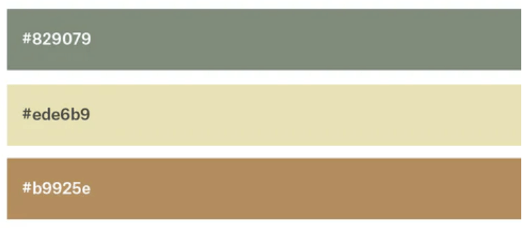
A beautiful pairing of brown offers up serious professionalism. The olive offers a hint of nature. Together, this is a color scheme that conveys grounded maturity.
18. Red, Yellow, Cyan, and Bright Purple
Combining kid-friendly primary colors gives us an optimistic, youthful combination.
19. Light Pink, Green, and Sea-foam
The combination of natural greens and blues with a soft pink accent feels warm, soothing, and luxurious.
20. Turquoise and Violet
A bright, high-contrast pairing like turquoise and violet offers a sense of excitement.
21. Light Pink, Sage, Sky Blue, and Grape
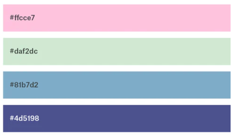
Here is another beautiful tropical palette reminiscent of a day at the beach. They have lively, lighthearted personalities made up of pastel shades.
22. Sepia, Teal, Beige, and Sage
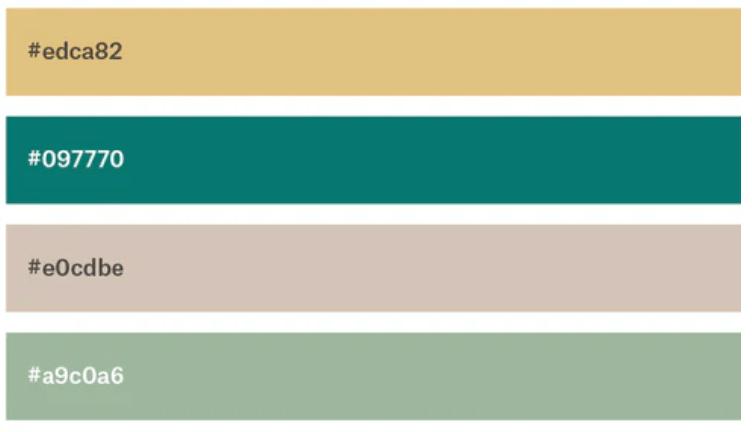
This color scheme shows off nature and the environment while being appropriate for a food product or restaurant.
23. Navy, Almond, Red-Orange, and <ango.
Navy and fiery accents, against a neutral almond, suggest trustworthiness and vigor.
24. Raspberry and Shades of Blue
In this palette, a trusted blue serves as the foundation, while the pinkish-purple addition of raspberry accentuates the elegant femininity.
25. Beige, Black-Brown, and Tan
Three shades of brown combined to create an ultra-classical and sophisticated look that is warm and inviting at the same time.
26. Beige, Slate, and Khaki
A pair of complementary browns that lean masculine. Khaki-grey accents lend an air of sophistication and elegance.
27. Electric Blue Lemonade and Aquamarine
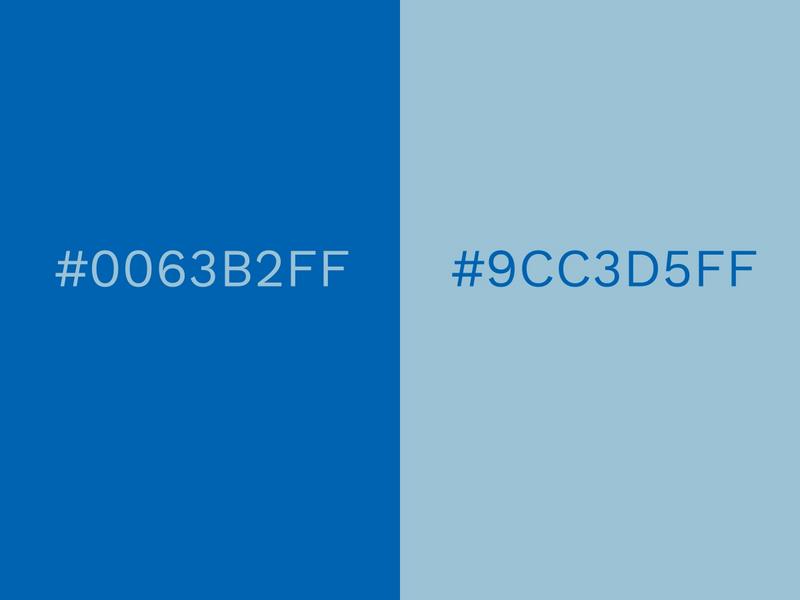
This lively blue color brings about a sense of trust and relaxation when added with an Aquamarine color. This color combination is one of the most attractive colors to get the customer’s trust.
28. Gold, Charcoal and Grey Golden
Gold, charcoal, and Grey Golden tones illustrate nature and a sense of cheerfulness, beautifully complemented by black and grey tones that add a layer of maturity.
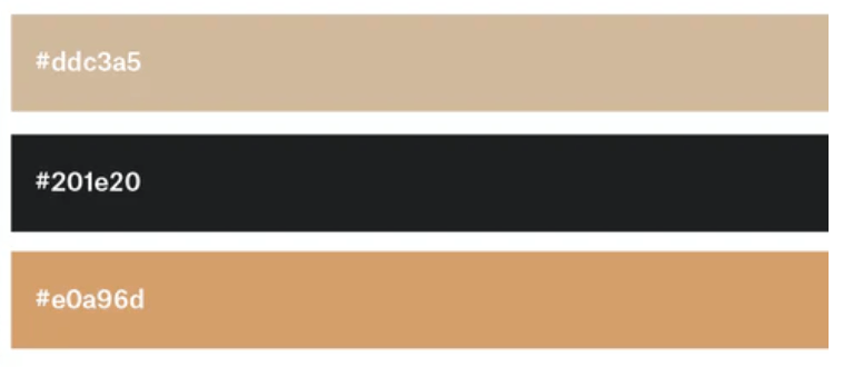
29. Tan, Deep Turquoise, and Black
As a primary color on a natural, masculine tan background, turquoise is brought forward to emphasize its potential benefits as a rebirth and nature-inspired hue.
30. Pink and Cream Gold
Pink orchid waffles are close to purple territory in their vivid hue. Luxury and warmth are the hallmarks of Cream Gold, with its liquid gold texture that tempts the eye. This effect is beautifully enhanced by Orchid, which easily envelops Cream Gold.
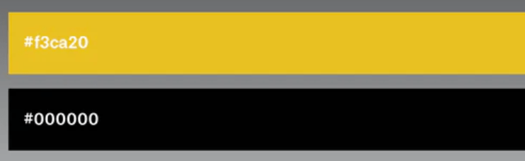
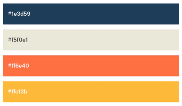
31. Black and Blazing Yellow
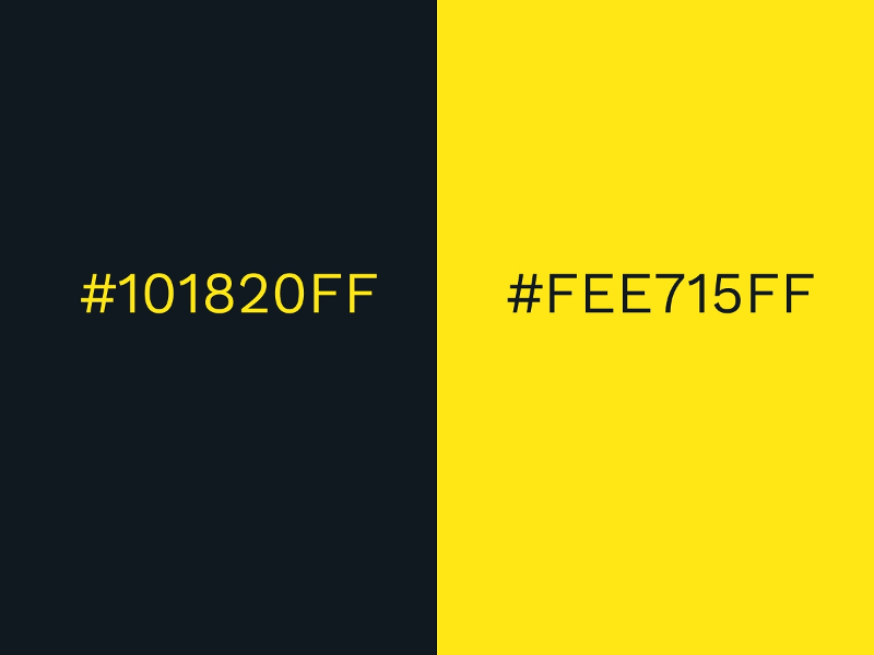
Combined with black, yellow is ideal for creating a strong contrast that facilitates easy reading and understanding. The color black is mysterious, but the color Blazing Yellow appears to be more welcoming.
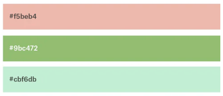
32. Pale Green and Bubblegum Pink
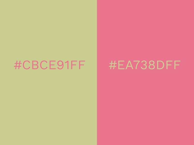
Combined with Bubblegum Green, Pale Green can prove to be an effective color palette. Just the right amount of contrast exists between the bright Bubblegum and the subtle Pale Green. When combined, the contrast between the two colors creates a striking contrast.
Create Beautiful Designs on Free Photo Editor/Collage Maker App
Enhance your designs with some of the best color combinations. You can use the Collart editor/design app made for iOS devices. Collart is free app with tons of FREE stickers and filters with other design elements, along with filters and features for you to edit photos, create collages and make simple graphic design work. You will have access to a wide range of color combination ideas, which is pretty amazing. Your ideas will finally be able to come to life with this new app!

👉🏻 Follow Collart: Facebook | Instagram | Twitter | Pinterest | YouTube | Website | TikTok
Related Posts


