25 Tips and Guide to Font Pairing
- January 5, 2022
- Inspiration
Font pairing is important when creating a design. The font you used for your design can have a major impact on the whole mood of your work. It is critical to consider the font when you are designing to avoid ruining the whole design.
Why is Font Pairing Important?
You should always consider your audience when it comes to creating content. You would always want to have more people appreciating your work.
Font pairing is important, especially if you are designing your logo, presentation, or infographic. It can also be applied to your invitations and postcards. If you had done your font pairs correctly, you would have captured your audience immediately.
Top Basic Font Pairing Tips
There are four major categories or families of fonts. The serifs, sans serifs, decorative and script. When you are doing font pairing, you would want to choose fonts from these families that can complement each other. Here are some tips that can help you choose the correct fonts to use in your design.
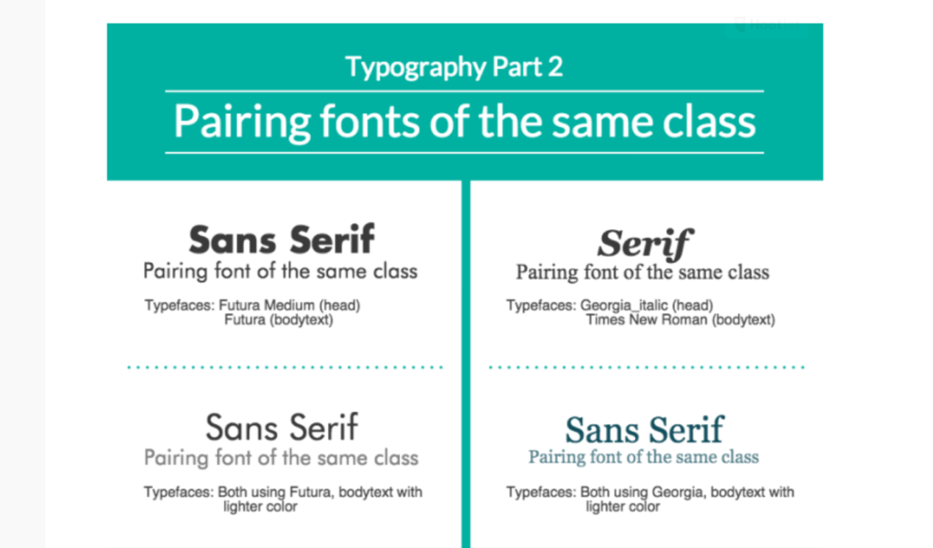
Use fonts that are within the same family or categories
The easiest way to font pairing is to use fonts that are within the same families or categories. These fonts are within the same family for a reason. They are designed to complement each other.
Use contrasting fonts
It is also ideal to use fonts that are contrasting to each other. For example, serif fonts go in contrast with sans serif fonts but can still work together.
Choosing the right type of fonts
But when is the best time to use these fonts? Here are some tips that you can use when using this family of fonts.
Serif Fonts
Serif Fonts are best used for content that has a lot of text, such as novels and newspapers. When used in a design, serifs go well with their opposite, sans serif.
Sans Serif Fonts
These fonts are great for websites, blogs, and flat designs. The rounded, even strokes of sans serifs give a warm and inviting feeling which can be helpful if you are creating calm content.
Decorative Fonts
These fonts are usually used for branding. Logos, posters, and other content for marketing. Because of its creative nature, many are using these to capture their audience.
Script Fonts
These fonts are used for materials that you would want to have a personal touch with. The handwritten effect of these fonts makes any material looks like it was done personally. Great for invitations and greeting cards.
25 Ideas for Font Pairing
- Monsterrat and Courier New
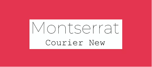
If you are using your material online, Montserrat is the font designed for web viewing. Courier New is the classic typewriter font that will give a retro vibe. It is modern meets classic font pairing.
- Alegreya Sans SC and Source Sans Pro

Alegreya Sans is best used for long headers. For the body, it can be paired with Source Sans. The 2 fonts are within the same sans family.
- Julius Sans One and Archive Narrow
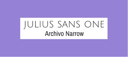
This pair has that professional and minimalist look. Julius Sans One is wide, which is why it is contrasting to the narrow base of Archivo Narrow.
- Oswald and Lato

The Oswald and Lato pair is also a pair of contrasting bases. Lato is wider than Oswald. This pair is good to use for long articles as the fonts feel stable and warm.
- Libre Franklin and Libre Bakersville
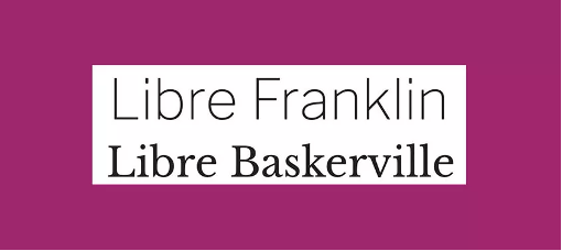
These two came from the same Libre categories, which, as said earlier, were designed to work together. The two fonts are good to use for screen content. Bakersville is good to use for headings, and Franklin is good to use for the body.
- Kaufmann and NeutraDemi
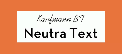
If you are after the unexpected tandem, you can go for this font pairing. The handwritten effect of Kaufmann goes well with the sans-serif effect of Neutra.
- Josefin Slab and Patrick Hand
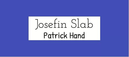
This font pairing is more for modern and young-vibe content. Creating content with these fonts can give you content that is filled with character and has that friendly vibe.
- Caslon and Myriad
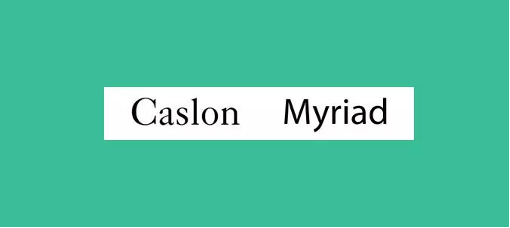
If you are after a classic vibe, you want to use these font pairing. This can be used for business-setting content. Myriad is used in corporate communications of Apple.
- Fontin and Fontin Sans
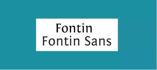
Another font pairing from the same family. These fonts can be used for content that has small size fonts. Your fonts may be small but still readable.
- Liberation Serif and Liberation Sans
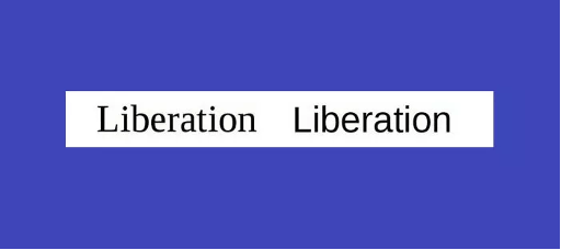
The combination of sans and serif can make a smart font pairing. These fonts are usually used in Windows.
- Gilroy and Jura
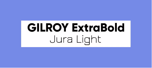
This pair is usually used for a more industrial but trendy vibe of materials. Gilroy for headers and Jura for the body.
- Playfair Display and Source Sans Pro
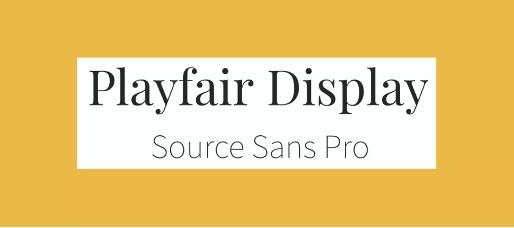
This combination has that contrasting effect. Playfair’s old-fashioned effect goes well with the modern touch of Source Sans.
- Bebas Neue and Monsterrat Light
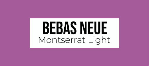
The bold and light contrast effect of this combination is good to use. It is easy to read and can be used for long texts.
- Myriad Black and Minion
This may have the same effect as the others, but this is still a good combination to try. It follows the effect of a bold and lightweight combination of fonts.
- Dax Bold and Caslon

- Antique Olive Bold and Chaparral
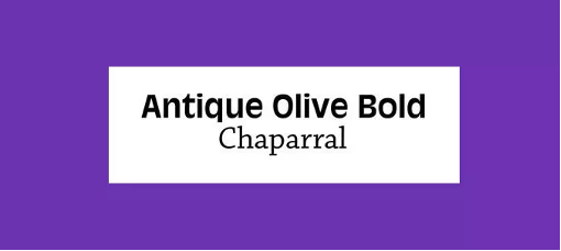
The tall x-height of Antique Olive and the modern feeling of Chaparral makes this combination perfect.
- TheSerif and TheSans
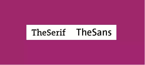
These two are complementary to each other, which makes it a great combination.
- Calluna and Calluna Sans
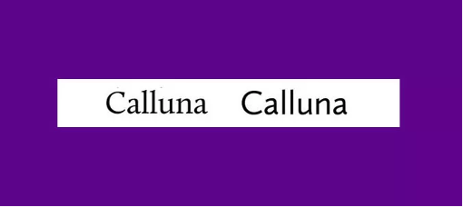
If it is from the same family, it will probably work as a combination.
- Calvert and Acumin

Calvert and Acumin are fonts that have many members in their family. And this combination will always work.
- Skolar Latin and Proxima Nova
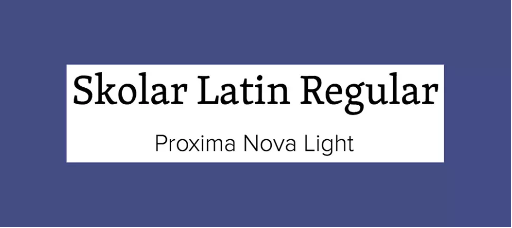
Skolar is described as a typeface for complex typography. Combined with a popular web font, Proxima Nova, it will create a good geometric combination between fonts.
- Pacifico and Quicksand
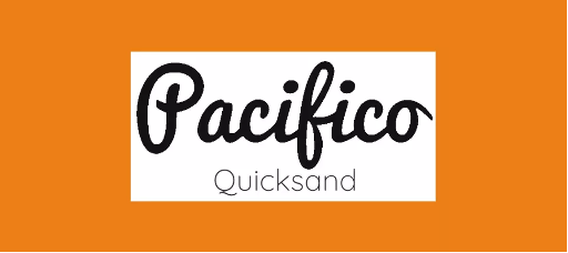
These 2 fonts aim for a free and flamboyant effect for their contents.
- Playfair Display and Raleway
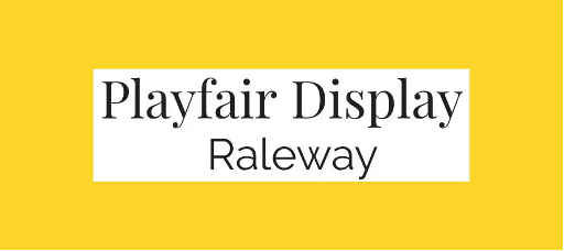
Playfair Display and Raleway are perfect if you want to achieve elegance.
- Super Grotesk and Minion Pro

These 2 fonts together create a modern effect but with a touch of elegance.
- Freight Sans and Freight Text
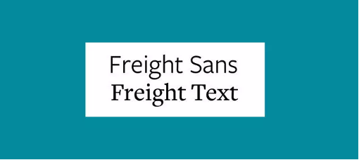
As mentioned earlier, when it comes from the same Freight family, it can work harmoniously.
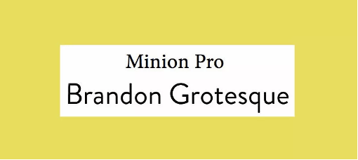
- Brandon Grotesque and Minion Pro

Minion Pro is a very versatile font that can be paired with many other fonts. This is a classic serif and sans-serif pairing.
When creating content, the limit is your imagination. The most important thing to remember is that when putting a text to your content, you must remember that it is not only the design that you have to consider. You have to consider if the message that you are trying to relay is readable and understandable.
All-in-one Photo Editor, Collage Maker and Graphic Design App For iOS
Collart is an all-in-one photo editor, collage maker and graphic design app for iOS. This free app allows you to create beautiful designs, with 1000+ massive resource library of fonts, stickers, vectors and more. Explore the font pairing available and see what works best for your content! Have fun creating beautiful content with Collart on your iPhone or iPad!

⚡ Find more tips here!
👉🏻 Follow Collart: Facebook | Instagram | Twitter | Pinterest | YouTube | Website

