50 Brilliant Brochure Design Ideas
- February 18, 2022
- Inspiration
Looking for some brochure design ideas? These days, marketing has gone digital. Many marketers are learning the ins and outs of digital marketing because they believe that this is the most effective way to market now. Many companies are paying money to have their brand visible on any digital platform such as social media.
Tips For Brochure Design Ideas
Brochures are a good way to reach your potential customers. Today, brochures have elevated their design game to make it more appealing to their audience. Get inspired with some of our brochure design ideas to create your own on Collart free brochure maker. Here are some tips on how you can uplift your brochure design game.
- Simplicity is still the best option.
Simple design doesn’t necessarily mean that it is boring. All you have to do is get creative. Putting in some textures instead of putting a lot of colors can make a difference with your brochure. What makes simple design effective is that, with a clean design, you can achieve a modern look, and the message will translate well.
- Surprise your audience
Create an effect to your brochure that is related to the item that you are marketing. Give your audience a little surprise. With this, your audience will surely remember your brochure.
- Shapes are your friends
Using different shapes to highlight items that you want to highlight is a good way to create an impact on your brochure.
- Experiment with folding
There are different ways that you can fold your brochure. You don’t always have to use a trifold layout. Aside from the classic folded booklet layout, you can expand your option by making it longer and folding it like an accordion. You can go more experimental with folds as long as it is aligned to your brand’s personality.
- Subtle adjustments can make a huge difference.
A simple cutting off corners of your brochure can give a huge difference with the effect. Having round edges will make your brochures softer and will have a friendlier vibe compared to when it has a sharp and pointed edge.
50 Brilliant Brochure Design Ideas
Here are some sample brochure design ideas that might help you get inspiration for your brochure.
- Classic and Sophisticated
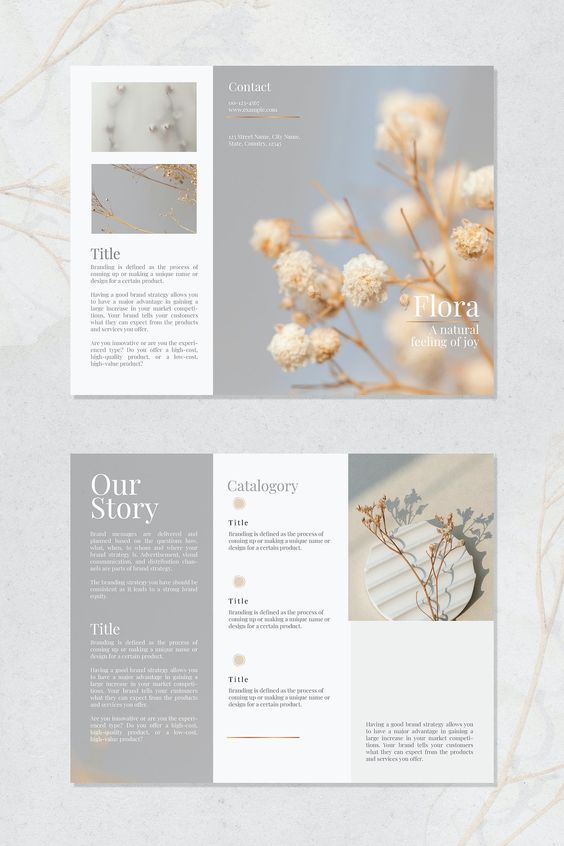
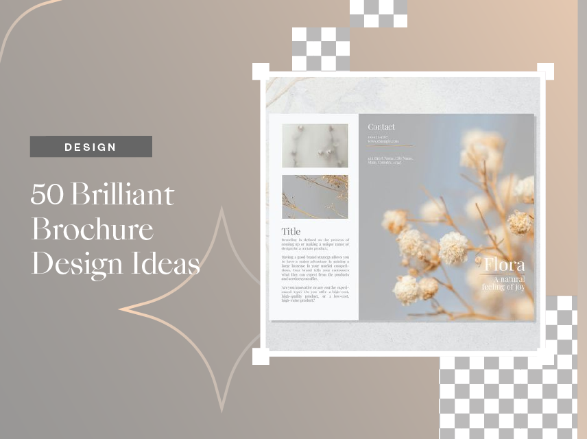
With light colors and classic font, you can achieve this sophisticated and classic look for your brochure.
- More than trifold
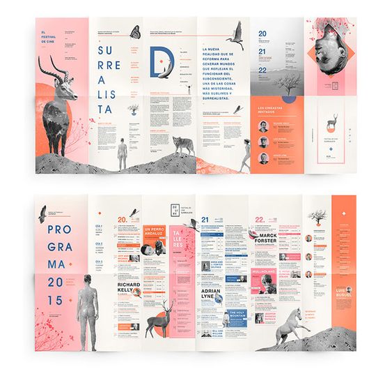
A brochure can be more than a trifold. As you can see with this example, it was folded into 12 sections. It is also using bold colors and graphics as a design.
- Use of non-complementary colors
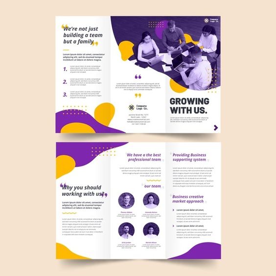
Violet and yellow are non-complementary colors in the color wheel. The use of funky colors makes this brochure fun and friendly-looking.
- Like a poster
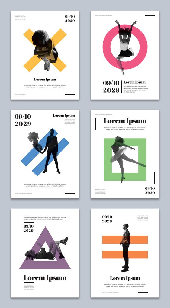
Have a brochure design idea to create one that looks like a poster inside? Create a different cover and surprise your audience with impactful graphics when they open the brochure.
- Horizontal Layout
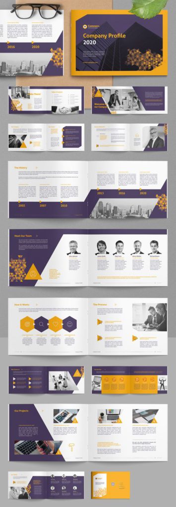
Create your brochure booklet in landscape so you can put information horizontally.
- Black combined with other colors
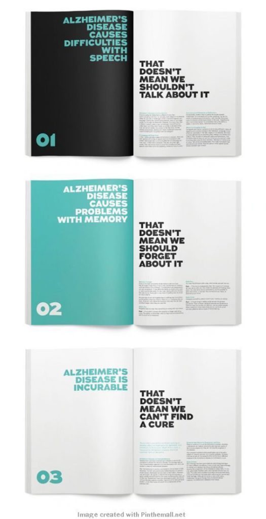
Black can be combined with all other colors, especially if it is a bright one. Combine your colors with black and achieve that modern, sophisticated effect.
- Go circular
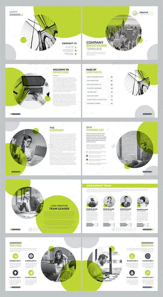
Circles are good to use, especially if you are after a fun vibe for your brochure.
- Cutouts
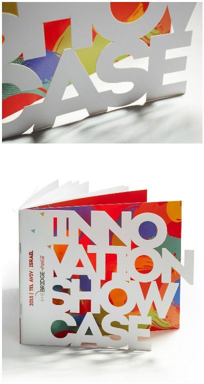
Be experimental with your brochure booklets by putting in shaped cut out on different parts of your brochure.
- Be bold and colorful
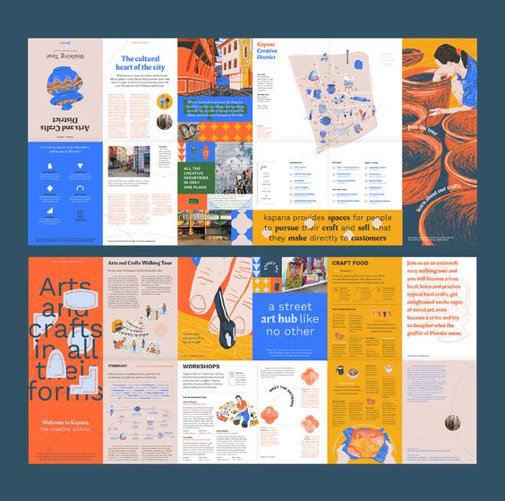
The use of bright colors and bold drawings for this brochure makes it appealing to the eyes.
- Monochromatic
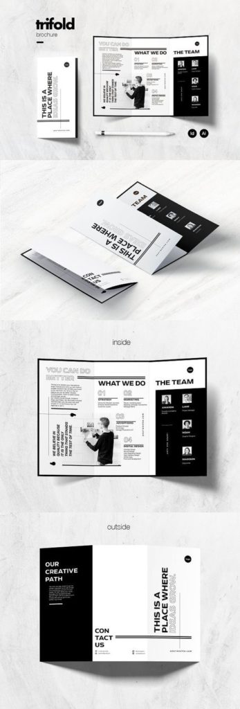
Black and white will always achieve modern sophistication.
- Highlighting your best item
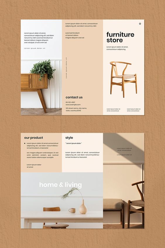
This brochure for a furniture store highlights its best product and style, combining it with minimalist font and light colors.
- Get inspiration from different layout
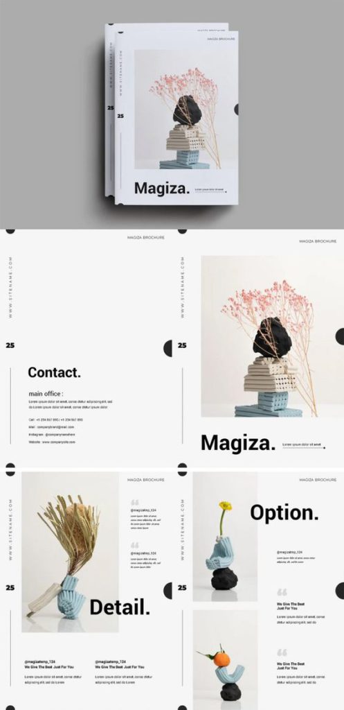
This brochure looks like a film from Instax. It is a simple catalog layout that highlights their work.
- Irregular shapes are good
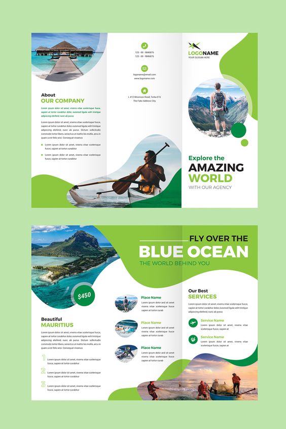
Irregular shapes can make your layout fun-looking. Combine it with fun colors to make your brochure appealing.
- Go bold with colors
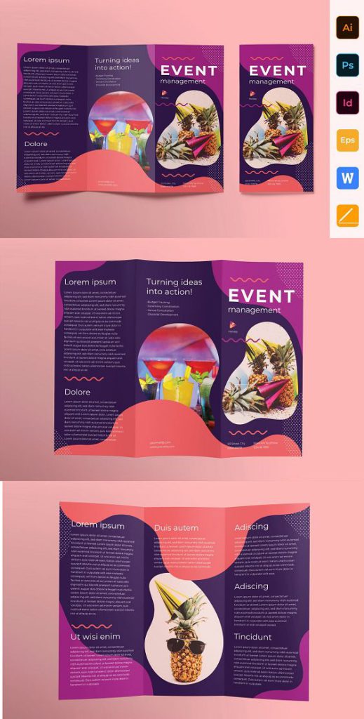
This brochure experiments with bold colors and irregular shapes.
- Put in some impactful graphics

This brochure’s layout gets the attention of the audience using photos of the body parts. It creates different textures and effects.
- Go minimalist
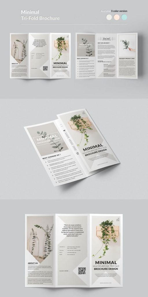
You can never go wrong with minimalist design. It is classy and sophisticated.
- Stick with your brand color
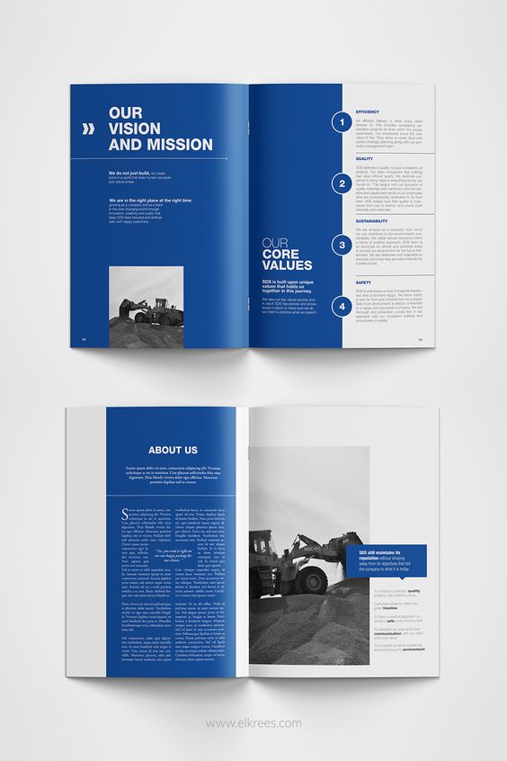
You don’t have to use all the colors in your palette. Choose one that perfectly represents your brand and combine it with white.
- Separate pages
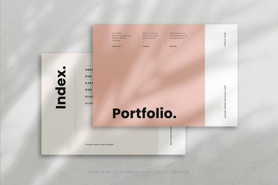
You can create brochures that have separate pages and not just the common booklet layout.
- Extend your layout to full spread
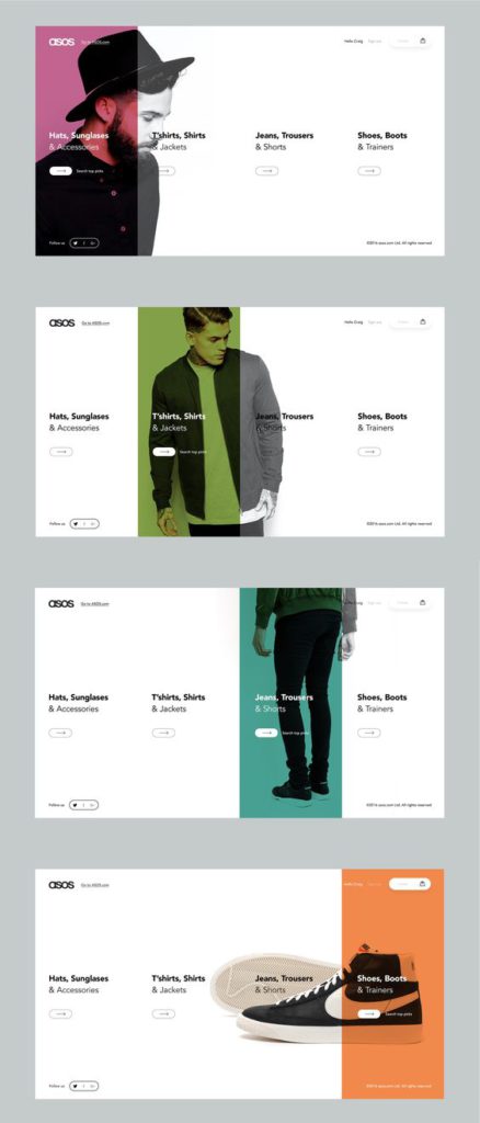
Regardless of the fold, get creative with your layout and extend it to the full spread.
- Use of different shapes to highlight
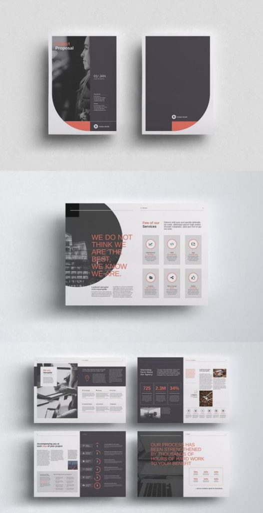
You can use shapes to highlight photos. You can also use block colors as a separator for your brochure.
- Explore typography
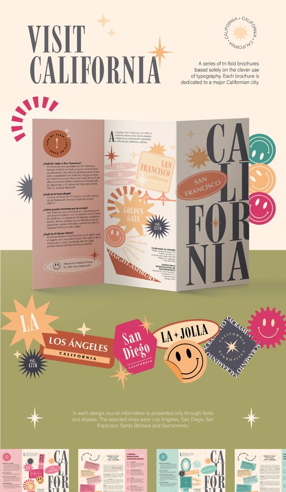
This brochure for cities of California explores typography as their layout and creates a fun and youth-looking brochure.
- Highlight your photos
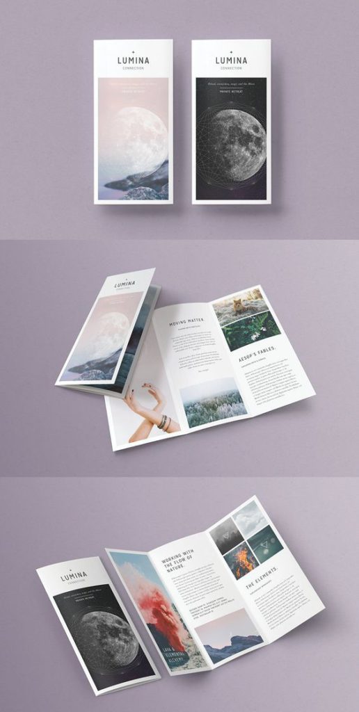
This brochure keeps it minimalist by not changing any colors but instead putting the best photo in its layout.
- Different cut
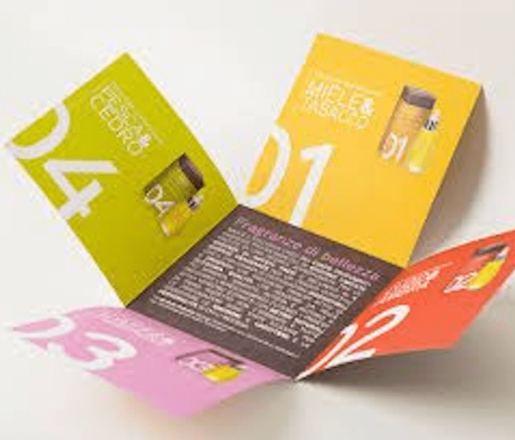
Aside from its colorful design, this brochure has an impact because of its different folds and shape.
- Fun colors
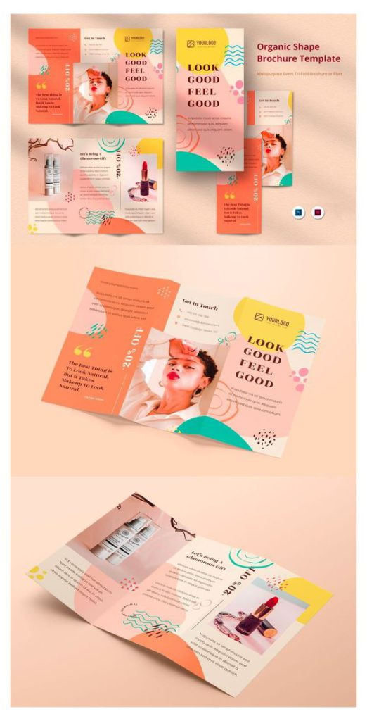
Brochures with fun colors are always good for customers. Fun colors combined with a good photo make your brochure appealing.
- Work with icons
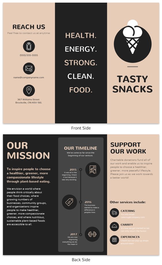
This brochure sticks to 2 colors only. They work with icons for their infographics.
- Accordion layout
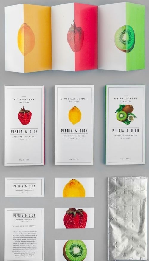
This spread uses an accordion layout. Aside from that, they created one side to highlight all the flavors that they have. Minimalist yet very colorful.
- Enough with the folds
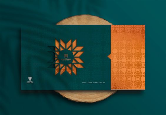
Why not create a brochure that looks like an invitation. Get creative with the cover and use the colors of your brand.
- Make them pop
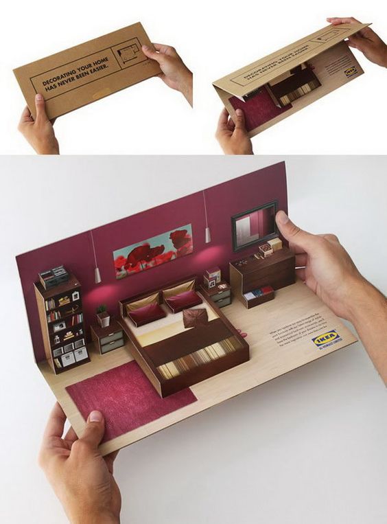
Keep your audience surprised by creating a popping illusion on your brochure.
- Make them stand
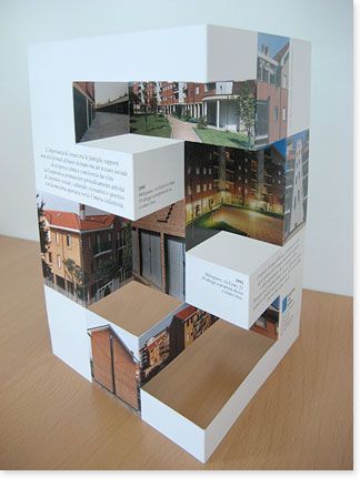
Why not create a brochure that can also stand on its own?
- Cut them irregularly
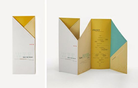
Your brochure doesn’t have to be square or rectangle. It can be an irregular shape.
- Make them interactive
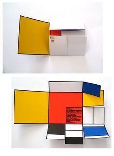
Like this brochure, you can make yours interactive for your audience.
- Make your photos the cover of your trifold
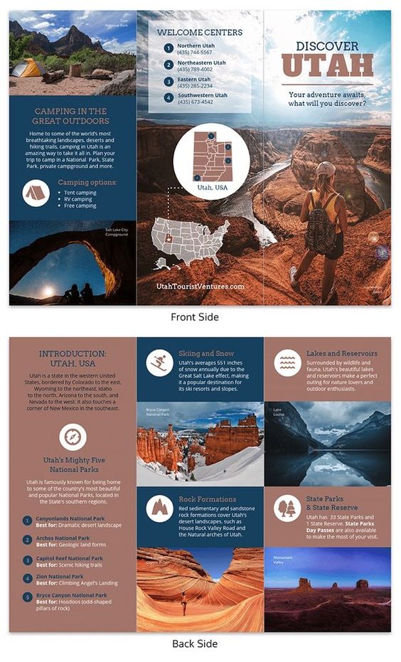
If you have a good photo to showcase, why not make it two parts of your tri-fold and make it the cover.
- Hexagon design
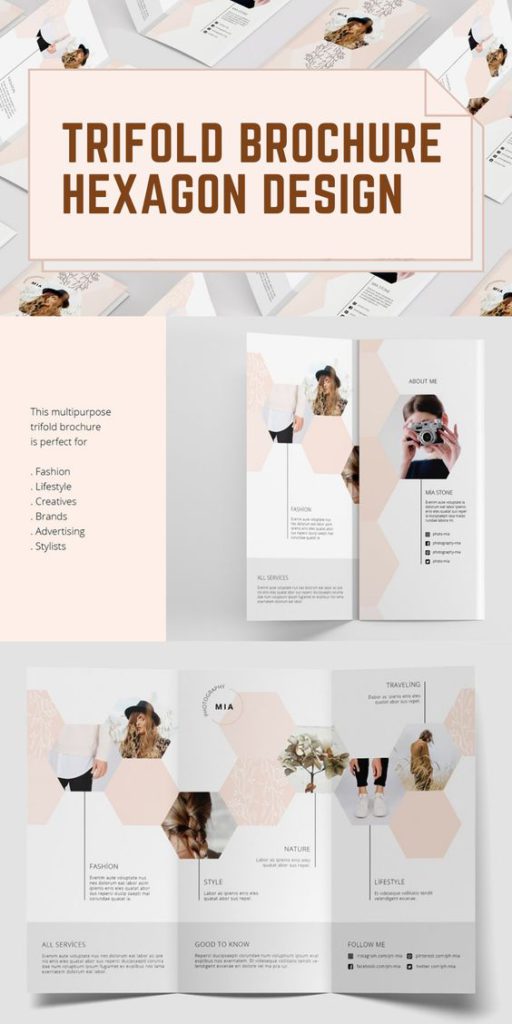
This hexagon design is good for creative design or step-by-step layout.
- Go dark

Black combined with gold screams elegance. This layout simply achieved the “wow” effect.
- Within the same palette
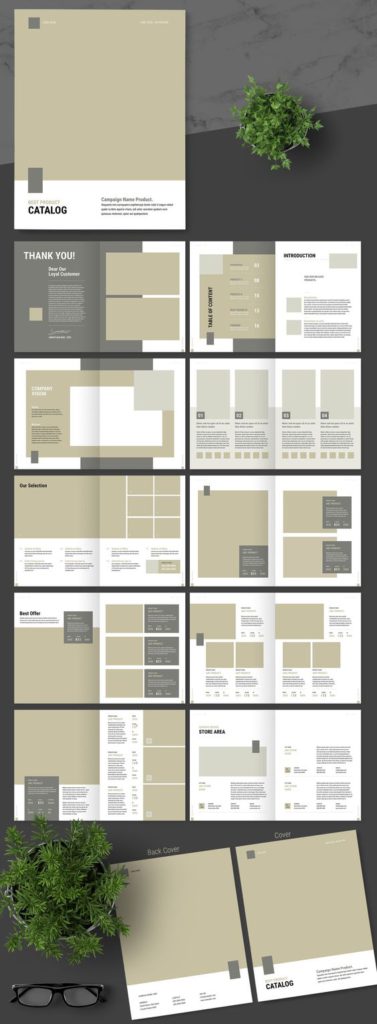
Create layouts or color blocking by choosing the perfect palette for your brand.
- Add textures
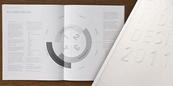
Add texture to your brochure to achieve a classic look.
- Get colorful
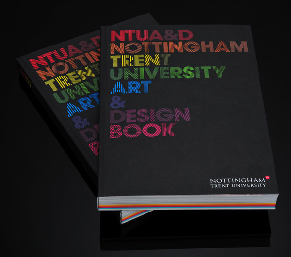
You can get as many colors as you like and add them to your brochure.
- Explore your pop art layout
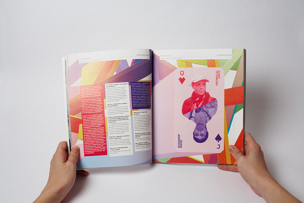
Keep up with the pop culture and create a layout based on pop art.
- Go contemporary
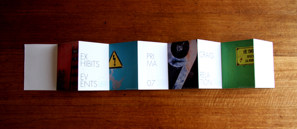
You can go with minimalist and contemporary design. Choose fonts that scream modern and add minimalist photos.
- Fill out the pages with colors
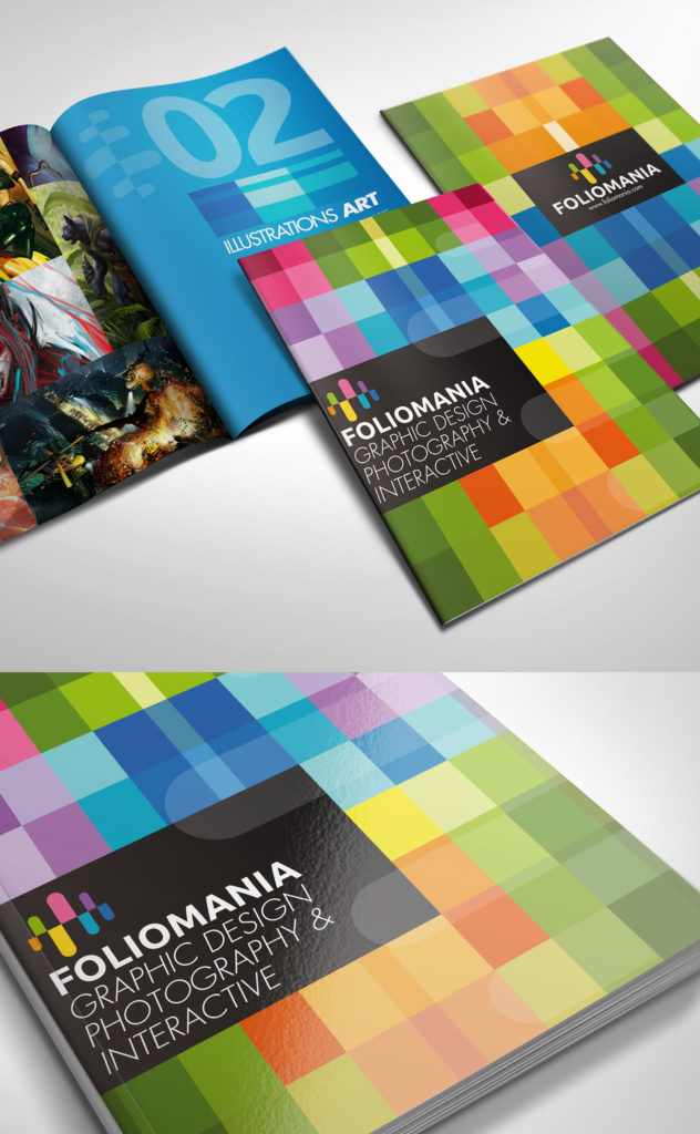
Not sure what to do with empty spaces? You can fill them up with colors.
- Show what you can do in bold text
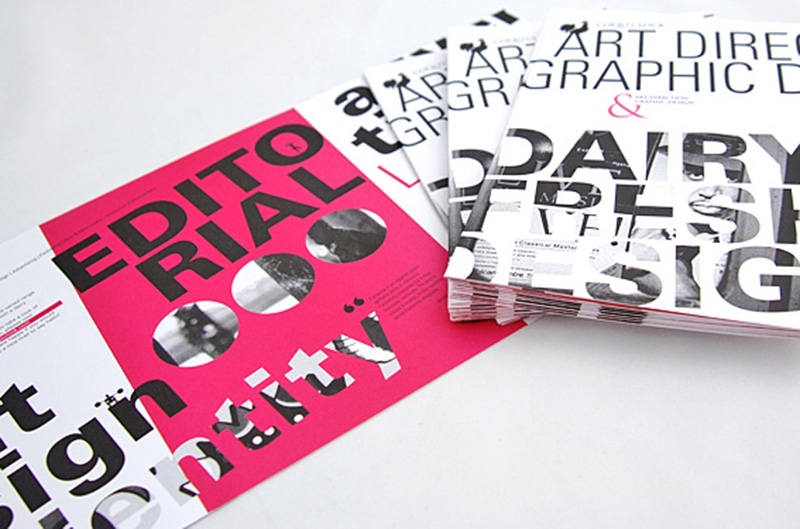
This brochure highlights what they do by putting in the large text of their service in their brochure.
- Put in some freebies
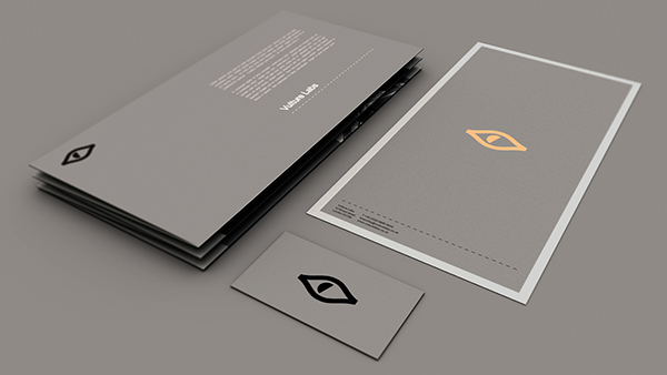
You can put in a free membership card or a CD inside a brochure if you like.
- Old paper background is still a thing
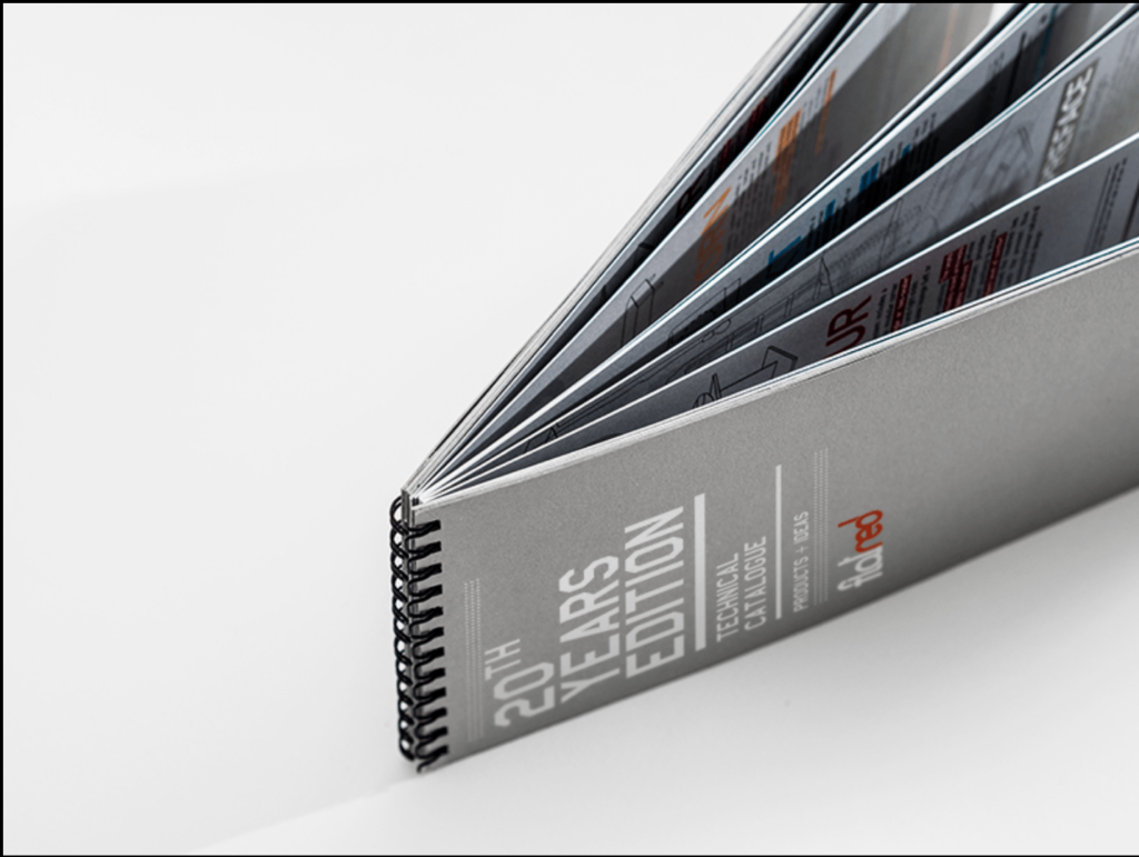
You can still use that old paper feels and create your brochure, especially if that aligns with your brand personality.
- Make it a notebook
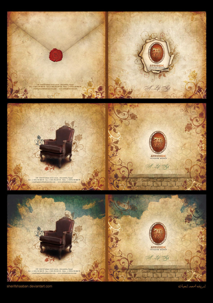
Layout your brochure like a notebook to add effect.
- Cut-outs
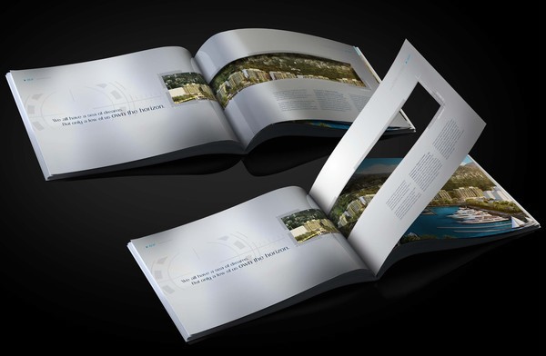
Cutouts are a good addition to your brochure. This brochure design idea will give it a more interactive effect.
- Showcase photos

Sometimes, brochures don’t need much text, but photos of what your brand is all about. Layout all your good photos in your brochure to capture your audience.
- Horizontal Tri-fold
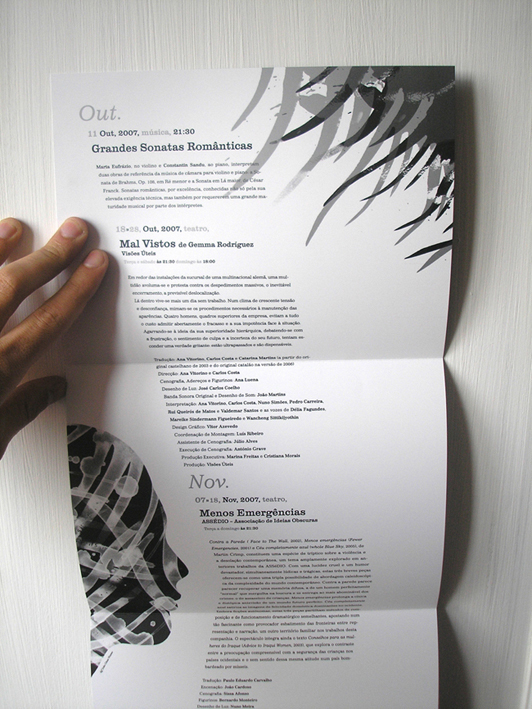
Explore the horizontal tri-fold layout for your brochure.
- Make them small
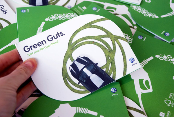
You don’t have to go full A4 when creating a brochure. Get creative and create a small yet informative brochure for your brand.
- Explore your tri-fold
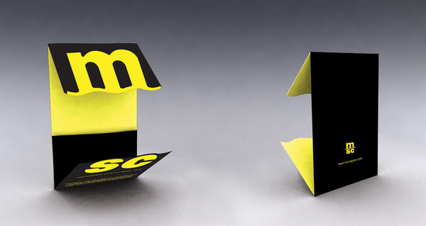
There are other ways to do tri-fold, and you can experiment with it and incorporate it with your layout.
- Go triangular
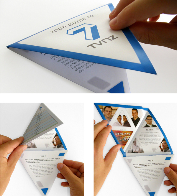
This triangle layout brochure also has a surprise shape once opened. This makes it more interesting.
Create Your Own Brochures With Collart Brochure Maker App
Download Collart on iOS today and unleash your creativity with our all-in-one photo editor, collage maker and quick graphic design app. With our extensive brochure design ideas, we hope to inspire you to create your own brochures With Collart free brochure maker app!

👉🏻 Follow Collart: Facebook | Instagram | Twitter | Pinterest | YouTube | Website | TikTok
