15 Useful Tips to Create Perfect Portfolio Design
- February 17, 2022
- Design
The portfolio design is the window to showcase and make your work sing. It helps you grow your business by networking and connecting with potential opportunities. How do you expect potential clients to get inspired by your incredible work without actually seeing a final product? Portfolio design ideas can solve this problem. You need to create a perfect portfolio design to stand out in the crowd.
What makes the best portfolio designs?
The power key to knockout first impression is your perfect portfolio that showcases your work and demonstrates your skills. You have to balance your portfolio design. See portfolio as a way to connect people for building relationships. It will help you in balancing your portfolio and identifying what to add to it. With it, your portfolio shall convey:
- Who you are
- What you do
- Examples of your work
- An easy to navigate format
- How to connect with you
15 inspirations for portfolio design ideas
Let’s get some inspirations from some of the best portfolio designs.
1. Showcase only your best pieces
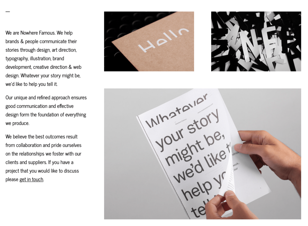
These pieces are the best performers with the most engagement and good results. The Nowhere Famous agency showcases their best pieces on the face. These are all engaging, eye-catching, and clickable to engage you more.
2. Thoughtful about what to include
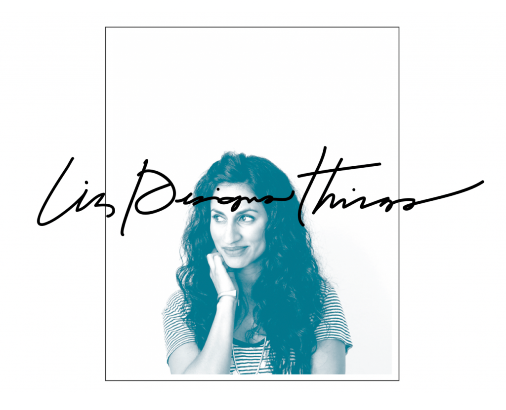
Think about what to include in your portfolio. Don’t add everything you have ever created. Think of your portfolio as a way to build more relationships and snap clients.
It shall reflect the work you have done in the past and plan to do in the future. Check out Liz Grant’s portfolio for inspiration. It is simple, elegant, and easy to navigate.
3. Decide how many samples to include.

The fundamental rule is to prefer quality over quantity. At most, fifteen to twenty examples will be good enough. Design your portfolio from the viewer’s perspective. They will browse and click only on a few samples before making a decision.
Look at the Olly Sorsby portfolio for ideas. It’s simple and draws viewer attention directly to all catchy eye designs.
4. Go for a variety of designs.

Your viewer can be from any industry. Don’t limit your portfolio to one niche and add different samples. However, mixing everything can be confusing. It shall be aligned and create a natural flow.
To get an exact idea of aligning and displaying various designs, visit Studio Mast’s portfolio
5. Choose the most creative and unique work.
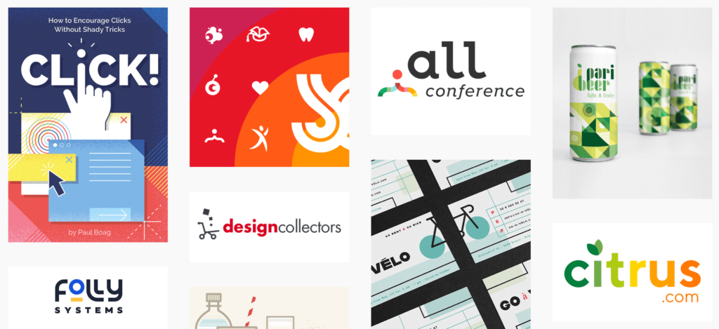
Check out Duoh’s portfolio. These pieces are creative and don’t follow traditional WordPress theme trends. They’re something special, and you should feel inspired by their originality. You can create something like this, adding uniqueness and creativity aspects to your portfolio.
6. Ensure you have a high-resolution portfolio
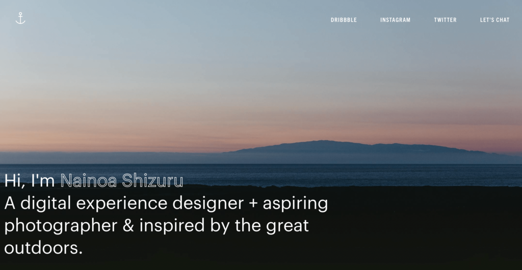
An image on your screen may not be best on a large led. It is best to stick with only high-resolution images in your portfolio. Clear close-ups also create drama and give your portfolio a high-quality look. The Nainoa Shizura’s portfolio features high-resolution photos in their portfolio.
7. Make your physical portfolio
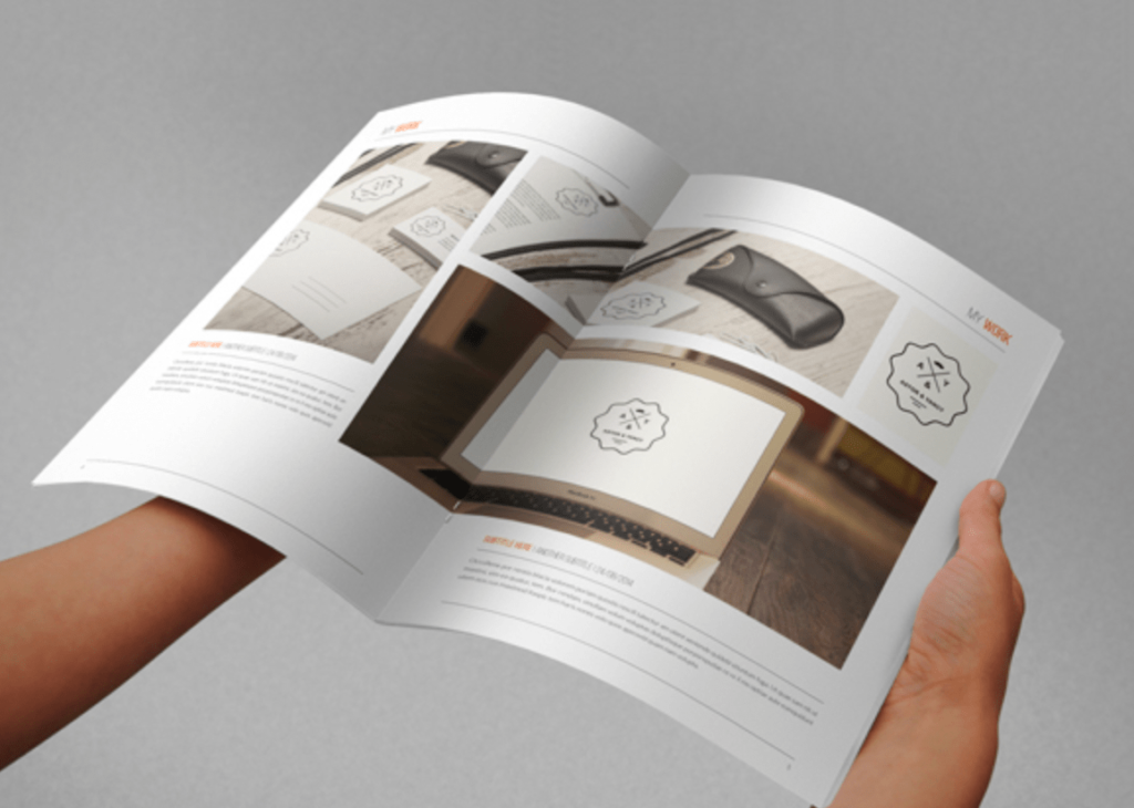
Typically designers use online portfolios, but if you work in the print media industry, you can create a physical portfolio. You can create a physical portfolio similar to the Abra Design one as it’s handy with magazine quality.
8. Update with trends
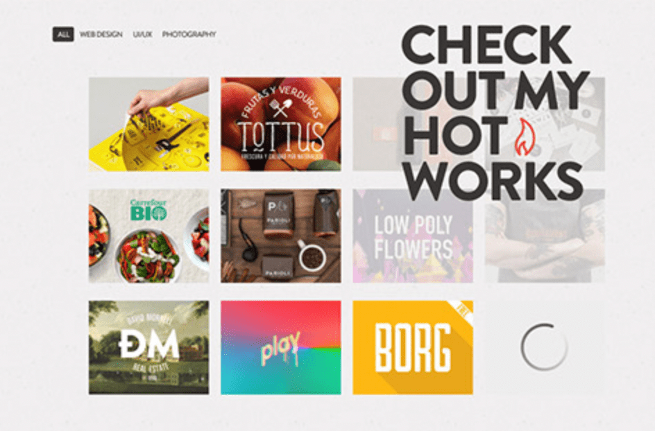
Tech and trends frequently change, so don’t include anything that is years old in your portfolio. Your portfolio shall convey a silent message that you update with trends like Robert Gavick one page portfolio.
9. Snap to Add photos
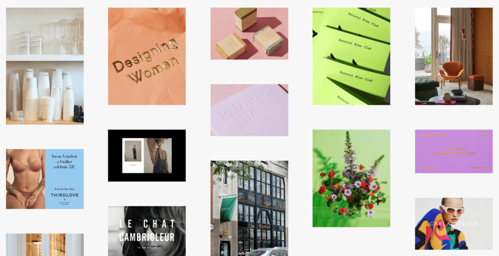
Hire a photographer to snap images of the print piece, then add them to your portfolio. Many of the Lisa Hedge pieces are also photographed instead of other static PDFs.
10. Filter final portfolio samples

It’s said that the most challenging part is to drop a sample from portfolio selection. You don’t want your portfolio to become clumsy or look like group work. So make sure the final pieces are cohesive and form your brand. Like Jessica Comingore, keep the portfolio consistent and clean.
11. Make sure the portfolio flows nicely
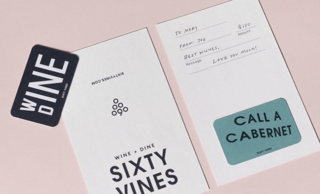
. Think about the lines, font, colours, and angles. They shall be aligned, simple, and give a nice natural flow like Tractor Beam Portfolio.
12. Add Past work and self-samples
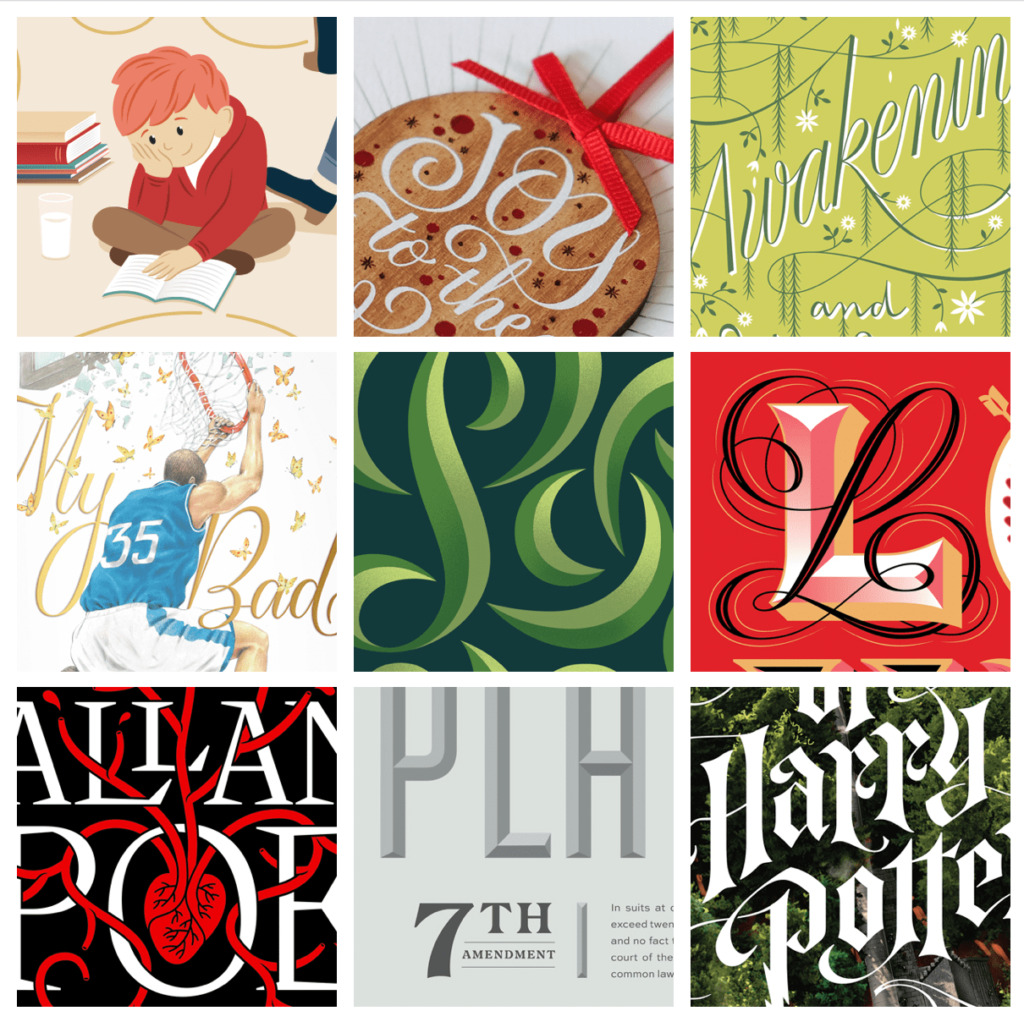
People often neglect portfolio designs just because they are not meant for paid clients. When you are showcasing a portfolio, you have to exhibit what you are capable of; not just simply displaying any past work. See how Jessica Hische includes self-projects in her creative portfolio.
13. Make your Portfolio enjoyable
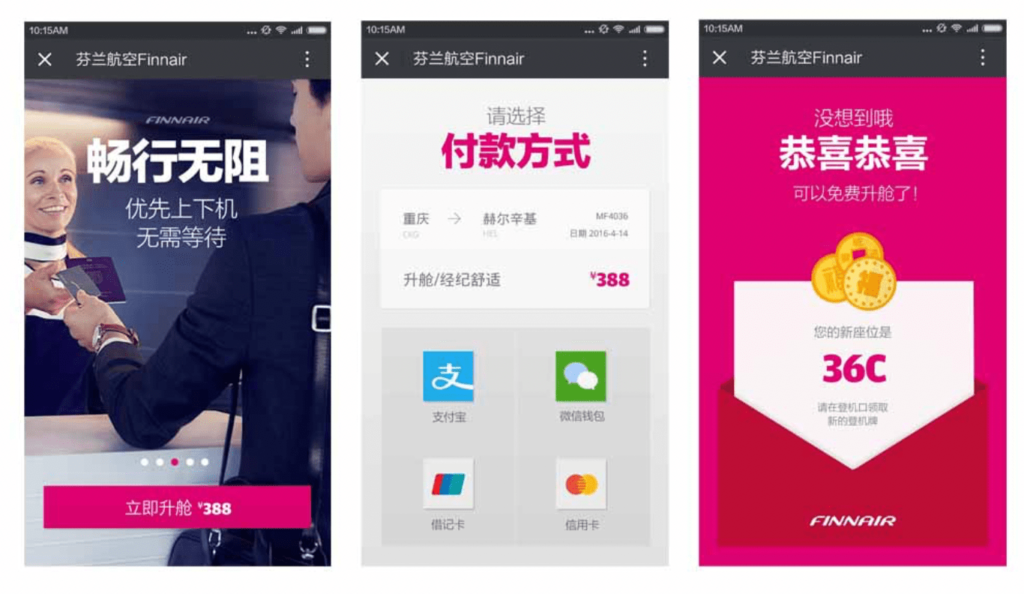
Don’t forget to add your posters and magazine work to your portfolio. You can use include your artwork and give it a pro photography touch. For inspiration, check out Kendra Schaefer’s portfolio mock-ups.
14. Get close-ups with other prospects

Viewing in person is different from the online display. Try capturing overall and close-ups for exciting details of each piece you are showcasing. It can be similar to Steven Bonner’s vodka label close-up in his portfolio.
15. Don’t use flashy animations in your online portfolio
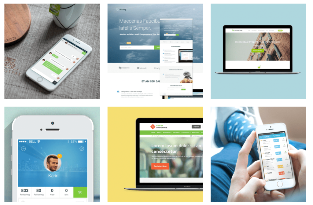
Keep your portfolio simple. Minimize flashy animations as they can be distracting sometimes. You can also try simple pop-ups like the Arun portfolio.
Create Portfolio With Free Graphic Design App
Try out Collart all-in-one free photo editor, collage maker and graphic design app now to create images for your stunning portfolio with these inspirations. With your portfolio ready and updated with portfolio design ideas, what’s next? Join relevant communities and set up your social platforms to interact and share your portfolio. Now it’s time to build connections and grab clients with your perfect portfolio!

👉🏻 Follow Collart: Facebook | Instagram | Twitter | Pinterest | YouTube | Website | TikTok


