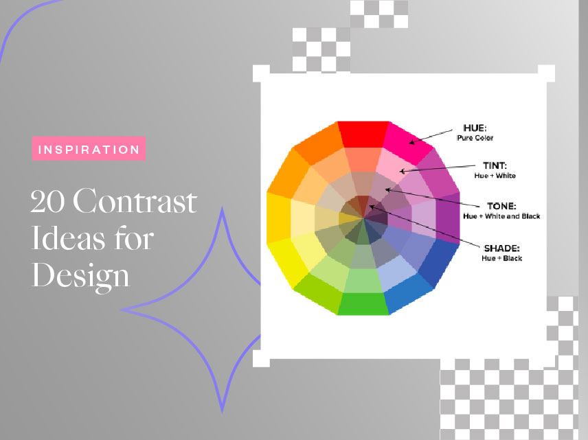
20 Contrast Ideas For Design
- May 12, 2022
- Inspiration
Looking for some contrast ideas for your next design? Contrasting is a key element when it comes to designing. It is one of the most vital principles that designers should always incorporate to create an eye-catching design.
Some of the most common principles are hierarchy, alignment, balance, proximity, repetition, simplicity, function, and contrasting colors. These principles are interrelated and can be found in every good design. The principles should always be kept in mind by a good designer as they can assist in developing ideas. Incorporating these principles makes it easier to distinguish between sound and poor design.
Out of all these principles, contrast ideas deserve special attention. It is one of the fundamental principles of design. In design, contrast refers to the separation of two or more visual elements within a design. Contrast is one main aspect of the contract itself. These help to determine how your design will ultimately turn out. Designers use this tactic to ensure that their designs capture a target audience’s attention or keep an individual’s interest while still seeming coherent. The use of contrast can allow designers to generate impact, highlight the importance, create exciting graphics, and create visual interest and dynamics.
Different Types of Contrast Ideas
It is important to know when and where the contrast is needed and how to apply them correctly. A composition with contrast attracts the eye, adds visual interest, and can be presented in various ways. Here are some common forms of contrast ideas:
Color Contrast
Contrast is largely determined by color. When the colors collide, it creates a confusing and difficult way of seeing the design. Therefore, it is imperative to choose the right color contrast. Consider using complementary colors that will not cause your audience any strain or confusion.
Size and Shape
The forms may be based on color, type, shape, or size. In terms of size and shape, contrasting shapes and sizes can enhance the visual interest in composition and assist in identifying important design elements. This will ensure that the designer’s audience is focused on the correct area. Overall having variation can create more interest.
Type and Font
In terms of type and font, they have to be precise. Designers should avoid using the same font for the entire design when working with layouts. Instead, look for a spot where you can incorporate variations. This gives you contrast but also keeps that unification in your design.
20 Contrast Ideas and Inspirations for Your Next Design
Here are some examples inspired by the contrast principles. You can apply these contrast ideas to your next design to make them more appealing!
1. Contrast with Dark and Light Colors.
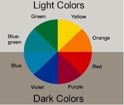
Implementing light and dark colors adding contrast to certain parts of your design is an easy way to make them more visible.
2. Contrasting with Typography Style & Weight
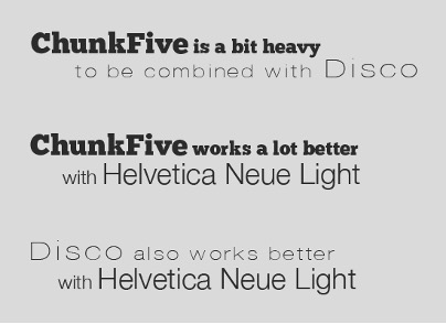
Many fonts offer various options such as light, bold, italic, condensed, expanded, and small caps versions. These choices allow you to organize your text and create contrasts between different features.
3. Contrast with Spacing & White Space.
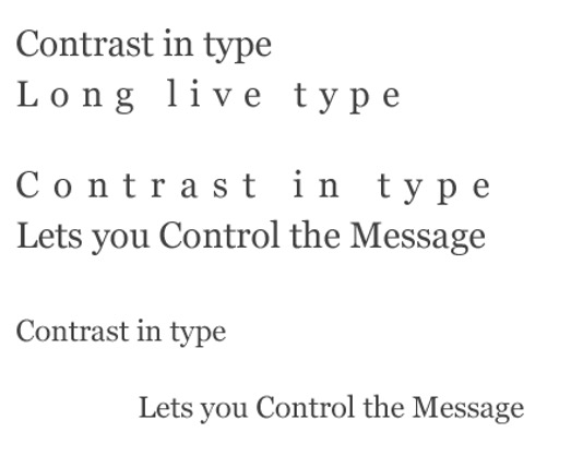
Sometimes we can’t resist the urge to enter as much information into your design as possible. However, too many elements packed in a single diagram can reduce readability. Having blank spaces can play an essential role in separating and organizing design elements for a balanced layout.
4. Contrast with Color Temperature.
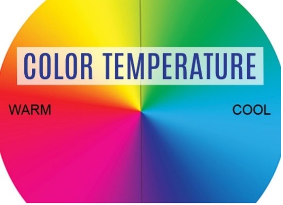
Mixing different color temperatures in a warm and cool design can create a dramatic contrast.
5. Contrast with Font Combinations.
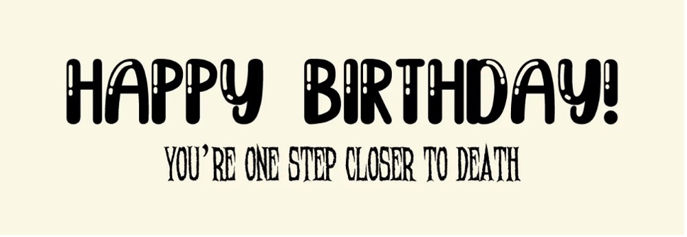
Fonts need to be visually distinguishable from one another, as they have different roles in your design.
6. Contrast with Shape: Edges & Corners.
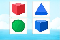
Shapes that have a rounder, softer, casual, or friendly appearance can be seen as qualities to create contrast
7. Contrast with Proximity & Separation.
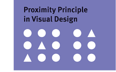
When we separate objects, we can help divide a design into distinct sections. It is also possible to use quantity to create contrast, e.g., a single object among a bigger group of multiple things.
8. Contrast with Compositional Choices.
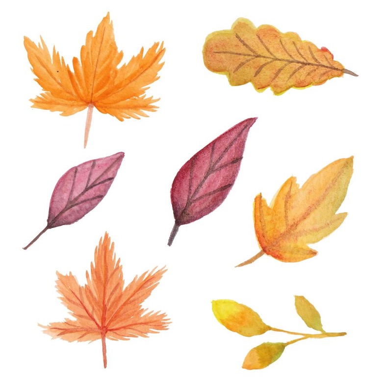
One way to close the line between two compositional techniques is to make an excellent compositional choice.
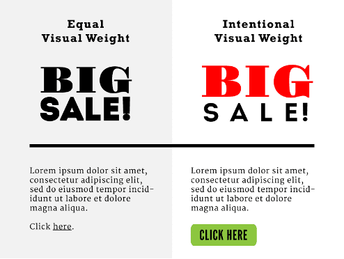
9. Contrast with Visual Weight.

This is just the part of your design that has the most visual weight meaning it has the highest contrast.
10. Contrast with Patterns.
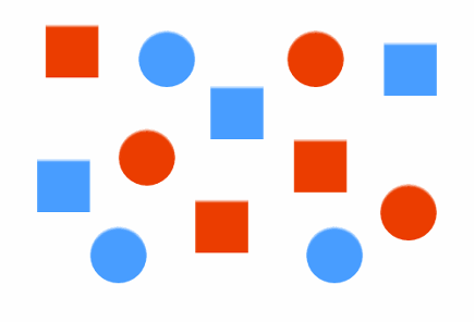
In a design, using different patterns can enhance focus and visual appeal, giving the design a more meaningful feel.
11. Contrast with Hues.
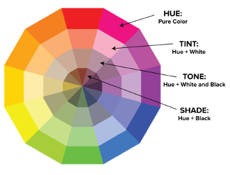
Utilizing hues, in contrast, you can design a color scheme that is both visually appealing and functional.
12. Contrast with Fonts.
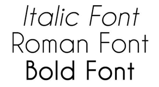
It is important when combining fonts to create contrast without conflict. The key point here is to achieve a balance when combing fonts to create fonts without clashing with one another. This is where practice and judgment come in handy for a designer to incorporate this successfully.
13. Contrast with Something Unexpected.
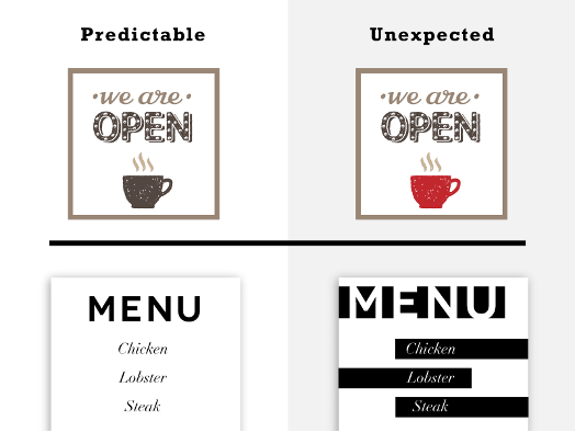
Creating an element of surprise can be a great way to create contrast in a design. Adding something unexpected like a bright color or small shape can spike the interest of an audience.
14. Contrast with Color Intensity.
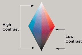
Using bright or dark/dull colors can strategically create high or low contrast places in a design.
15. Contrast with Visual Cues.
Visual cues can come in handy. You might point out a design element with an arrow or highlight it by surrounding it with a circle or other shape so that the audience can see the focus of a design.
16. Contrast with Scale & Size.
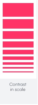
Contrasting with different size and scale create layers to the elements. If every object in your design comes in a similar size, there won’t be much variation or uniqueness.
17. Contrast among Simplicity and Complexity.
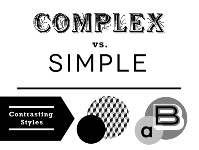
By contrasting complex and simple elements, contrast can enhance the effectiveness of a design.
18. Contrast with Texture.
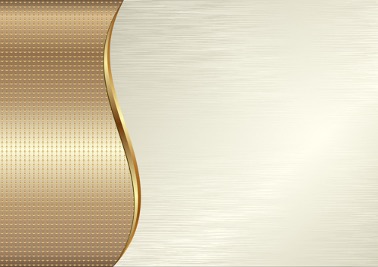
Adding textures against the plain background of your design is an excellent way to create a unique effect, whether through a printing effect or a vintage/retro look.
19. Contrast with Shape: Organic vs. Geometric.
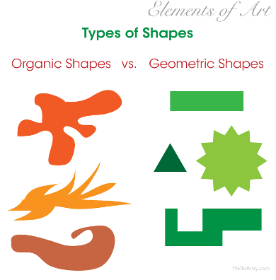
Basic shapes like rectangles, triangles, circles, etc., can be contrasted with curving and asymmetrical shapes.
20. The contrast between Position and Orientation.
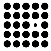
While having an ordered structure can ensure an orderly design, mixing things up in a purposeful and limited manner can contribute to the appeal of the final result.
Collart All-In-One Free Design App for iOS
From removing background, adding texts to photos and free trendy stickers to your designs, you can make use of the various tools to create digital artwork for free with Collart free photo editor and collage maker app. We hope this inspires to make use of image and design contrasts to create stunning work. Learn how to choose background designs, make use of stock images, and tips on font pairing! It’s time to put your creativity to test – show us what you’ve got!

👉🏻 Follow Collart: Facebook | Instagram | Twitter | Pinterest | YouTube | Website | TikTok
